2025
All the GitBook features, updates, improvements and fixes we released in 2025
Add inline button actions to any page — including search and Ask AI

You now have powerful new options for inline buttons that include search and GitBook Assistant inputs — allowing your users to type a question and activate a search or Assistant chat right from the page.
Plus, you can also create disabled buttons or buttons that trigger a specific preset search or query of your choice.
Here are a few examples of things you can do with the new button actions…
Add a search button with a pre-set search parameter:
Create an empty search bar that users can type directly into to find a topic:
Embed a place for users to ask GitBook Assistant something about your docs:
Add a disabled button to show something is inactive:
You can configure all of these options by hitting / and choosing Button to add a button to your page, then clicking the button to open the Label menu.
Set canonical and alternative page metadata

You can now set the page metadata for canonical and alternate URLs to help search engines understand the relationship between similar pages — which is helpful for SEO.
For example, if you use variants to document multiple versions of your product, but want the current version to be the canonical version for SEO reasons, you can now control this in the Page options menu for your page.
You can select another GitBook page in both the canonical and alternate fields, as well as external URLs.
An improved notification panel

You’ll notice that your notification panel has a new design to make it easier to parse active and inactive notifications.
It also brings in the new colors from our recent rebrand, and adds new icons to make it clear when a notification has been checked.
Other improvements
You can now stop GitBook Agent’s thinking process when you’re interacting with the Agent through the side panel. Simply hit the Stop button in the chat window.
We’ve made some visual tweaks to hint blocks to increase their contrast and make the content inside them easier to read. You’ll notice this in dark mode in particular — hint blocks are now much clearer in the GitBook app.
Following on from our recent rebranding, we've now updated the font within the app to be Inter. This new font should look clean and modern within the app, helping you do your best work.
Fixes
Fixed a bug that removed the border around site icons in the sidebar.
Fixed an issue that meant joining a new organization in GitBook when you were already logged in with your account would cause a crash.
Fixed a small hint block bug that meant page links and other mentions didn’t show a colored background as expected.
Fixed a bug in the editor where text colored blue would show as red.
Fixed a bug that meant submitting a change request review would reload the entire page unnecessarily.
A refreshed app look and feel

If you’ve visited our website or logged into the app today, you’ve probably noticed that it’s got a new look. We’re rolling out product changes with care, as we know it’s an essential interface for your docs.
You can read more about what’s new in our announcement blog post, but here’s a quick breakdown of the small changes we’ve made to the app to bring it closer to our new branding:
New colors – we’ve updated the colors across the app, reducing the amount of teal and focusing on blacks and oranges to match our new brand.
New images and backgrounds – We’ve also refreshed the imagery within the app to bring it up to date with our latest design language on our website and docs.
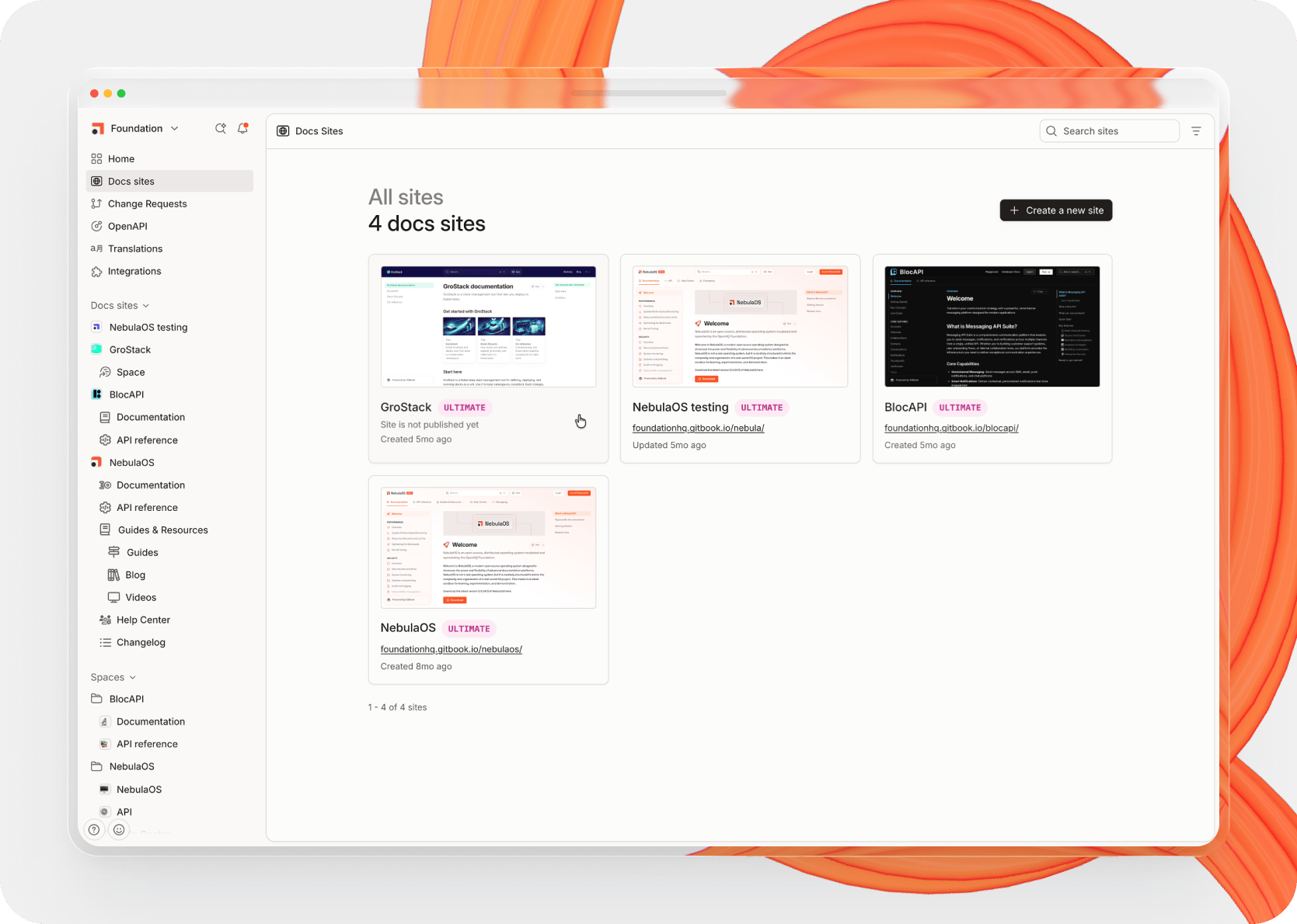
A refreshed home page – The home page has a new layout that helps you quickly jump to the change requests screen and other useful places. We’ll have more improvements coming to the home screen soon.
A new default page cover image – when you add a cover image to your page, it’s now a nice pale orange to match our overall branding.
Introducing GitBook Agent

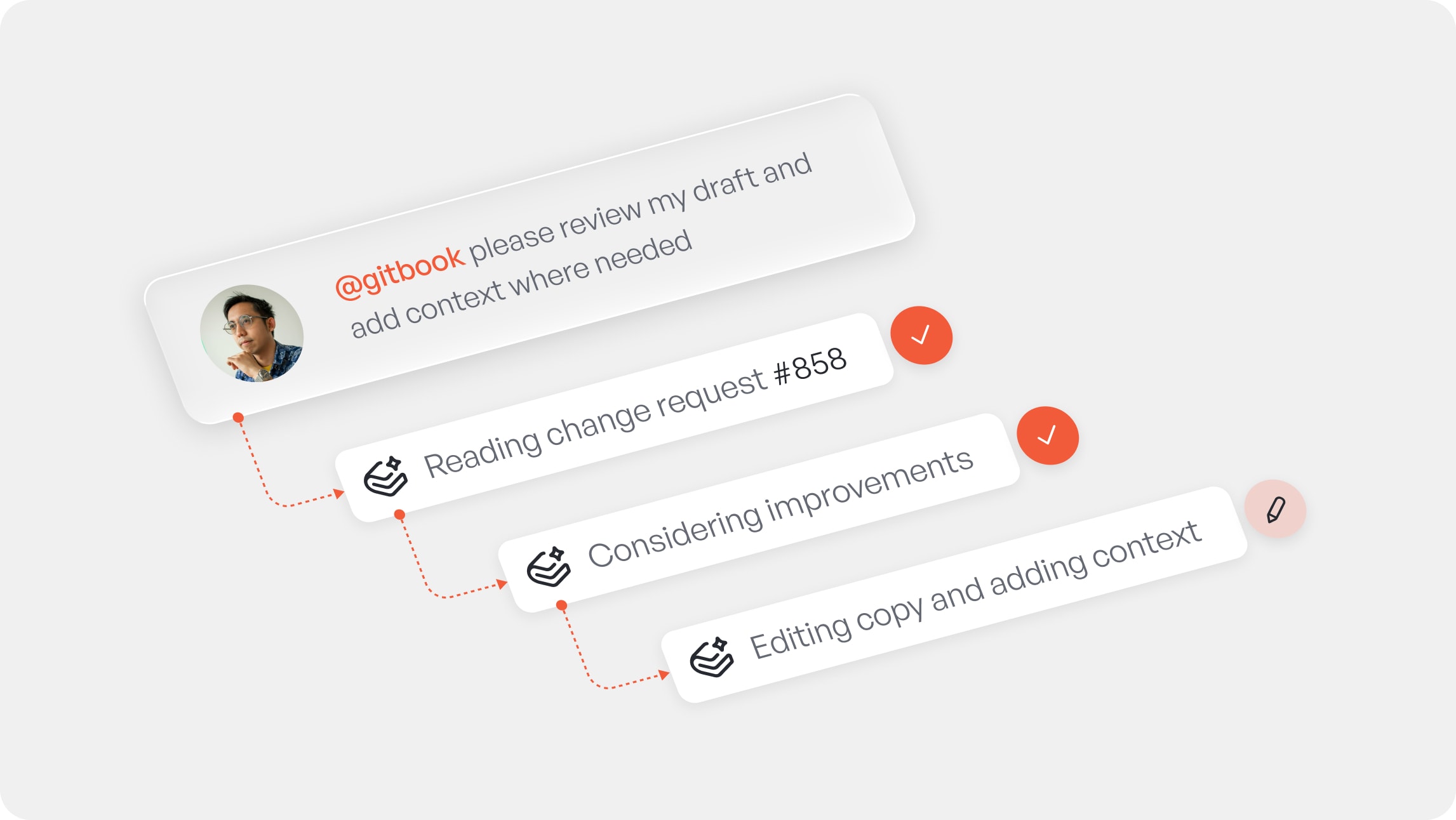
Today we introduced GitBook Agent — a collaborator who works alongside your team to ensure your docs are accurate, updated, and fueling growth.
GitBook Agent can:
Write docs based on a prompt
Ideate and implement bigger changes
Understand your style guide
Follow custom, organization-level instructions
Summon from a comment
Review your changes
Head to our announcement blog post to read more about these features — and what powerful upgrades will be available soon.
GitBook Agent is currently in open beta for teams on Pro and Enterprise plans. Give it a try in the app today!
Huge change requests improvements

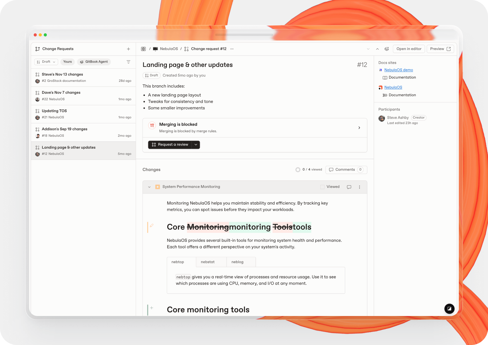
We’ve introduced a new change requests screen that brings every update across your organization into one clear, centralized place.
It’s built for speed and focus — making it easier to navigate, filter, review, and ship docs updates efficiently. You can see a list of change requests with powerful filtering to help you find precisely the ones you need.
And when you open a change request, you’ll see all the information related to it in one place — including the title and description, participants, reviewers, and even all the changes rendered in diff view.
There’s also a new Overview screen for individual change requests within a space that uses the same format to make reviewing changes easier than ever.
Embedded Assistant improvements

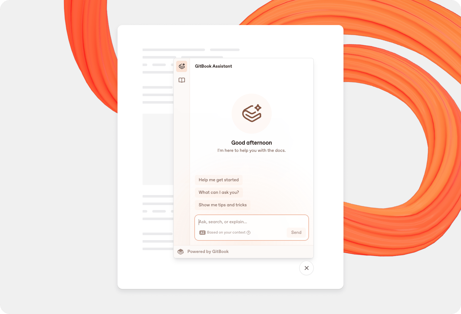
We’ve improved the styling and customization options for the embedded version of GitBook Assistant:
You can now override the default Ask button label and Assistant icon now, if you wish.
The Assistant now supports light and dark mode, and automatically adjusts to match your product or site’s settings. It’ll remember a user’s settings if they’ve browsed your site before.
The Assistant window is now very subtly translucent so it blends more seamlessly with your app or website.
You’ll also notice a new sidebar in the embedded Assistant, which lets you switch between two modes — Assistant and documentation. More on that below.
Embed your docs in your product

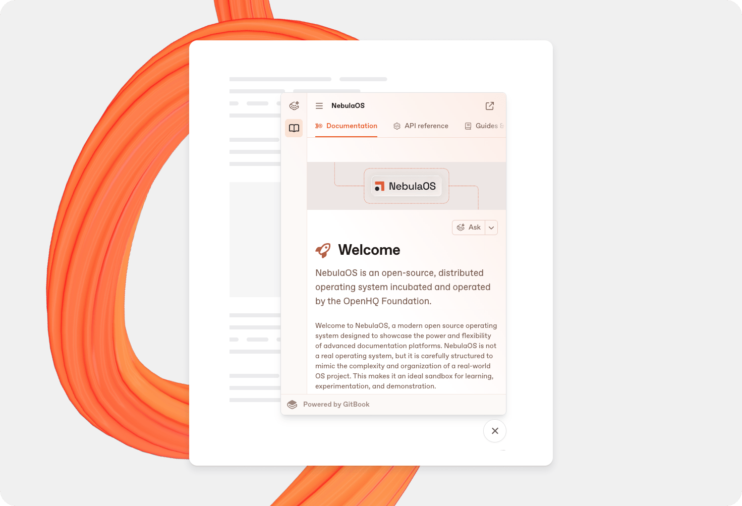
You can now embed your documentation within your product or website alongside — or instead of — GitBook Assistant.
Users can open the panel and browse your docs as normal in the small window. And if you’re using the Assistant in your docs, that’s available in the other sidebar tab.
Embeddable docs are available on Premium and Ultimate site plans — opening up this powerful embed feature to more users.
GitBook Assistant: Customize suggested questions
You can now customize the questions that appear when users first open GitBook Assistant and the AI search panel (on Premium sites or sites not using the Assistant).
You can define up to five custom questions in your site’s settings screen and these will be shown to visitors when they open Assistant or AI search. If you don’t add custom questions, users will see AI-generated suggestions instead.
Improved
We’ve tweaked the reasoning for GitBook Assistant to help it deliver responses faster.
{if} blocks now support all other block types, meaning you can create more detailed conditional blocks using adaptive content — including other {if} blocks for nested conditional content.
Fixed
Fixed an issue that could occur when importing tables via Git Sync that reset column widths to default rather than maintaining their custom widths.
Fixed a couple of bugs with lists within hint blocks that meant bullets and numbers were larger than, and misaligned with, the text next to them.
Page link titles, improvements and fixes
You can now set a shorter page link title that will appear in the table of contents — great for tidying up if you have a lot of pages with lengthy titles.
For example, if you have a page with a long title for SEO or accuracy reasons, open the page’s Actions menu and choose Edit title & slug, enable Link title, and then specify a shorter name.
This title will be used for all relative links to the page — including the table of contents, page # mentions, and the page footer navigation.
If you use Git Sync, your page will appear in the SUMMARY.md file like this:
# Table of contents
* [Page main title](page.md "Page link title")Improved
You can now hide some site spaces from the navigation at the top of your site
This PR adds the ability to hide single site spaces within non-default sections, extending the existing site space visibility feature. The implementation includes backend validation to ensure only specific site spaces can be hidden (single spaces in non-default sections), along with frontend UI updates to support toggling visibility for both variants and sections.
We’ve added a new message for when a Git Sync operation times out, to give you more information about the error and offer some solutions.
Fixed
Fixed a Markdown bug that meant hitting # then Space at the start of an empty line would open the page link menu and select the first link instead of creating a new H1 header.
Fixed a crash that could occur when unsuccessfully sending a non-critical notification within the GitBook app.
Fixed an issue that meant reusable content in another space was missing the external link back to the original content for editing.
Fixed a bug that affected variants on a default site section for sites that use share links. The variant would cause an infinite redirect when trying to preview the site.
Fixed a bug in comments that meant @ mentions and page references weren’t working properly.
Fixed a link menu bug that meant if you started typing in the search bar before the menu options had loaded, it would replace your highlighted text on the page.
A restyle for GitBook Assistant, improved menus and more
We’ve updated the look and feel of GitBook Assistant to give your content more space, added new menus across the app with a number of improvements, and released a ton of fixes.
A more polished Assistant experience

We’ve improved the style and layout of GitBook Assistant to make it more minimal and to give your content more space. The Assistant now appears as a full-length sidebar, nudging your content over while keeping a great layout no matter the size of your screen.
You might also notice that the styling subtly matches your site’s primary color — so the Assistant blends perfectly into your site and feels more branded to your docs.
You’ll also notice improved scroll effects on the chat stream and updated animations that are smoother and, frankly, prettier when answers appear ✨ Plus, there are now up and down buttons for easy navigation through your chat log.
Hit Ask at the top of this page or click here to try the latest Assistant improvements for yourself!
Improved menus across the app
Every menu in the GitBook app has been updated with new features, improved UI and better accessibility.
First, menus now have better focus management — so you can navigate using your keyboard, and if you use your mouse, focus will remain more consistent even when selecting from submenus.
We’ve also added search to every menu. So when you open a menu, you can just start typing to narrow down the options you see.
This search also includes submenu entries. So if you open a space’s Actions menu and type ‘Share’ it will show not only the Share menu item, but also the two submenu items within it — so you can quickly find and select what you need without much manual navigation.
These changes are live now across all menus in the app, so give them a try today.
Improved
We’ve tweaked the prompt used for GitBook Assistant to improve the page context and reduce the number of repeated searches. We’re constantly improving this, so there’ll be more fine tuning in the coming weeks and months.
Part improvement, part fix: We’ve added another filter to all the charts in the Traffic page in your site’s Insights panel. Before, the page only filtered the first chart to show page events — other charts didn’t have this filter, which resulted in some inconsistencies.
Fixed
Fixed a bug that would occur when some blocks (e.g. stepper, quote) only had a single block inside and you tried to open the Block options palette for that single block. Rather than the child block being selected, it would select the parent block. Now it will select the child block as expected.
Fixed the padding that appeared around the image options toolbar with a recent update.
Added aliases to the code block syntax selection menu, and fixed an issue that meant the text was too light.
Fixed the Share modal not showing members who have read access to a space due to the space being published to a site.
Fixed an issue that meant repos with multiple project directories could sometimes have their assets deduplicated in a strange way after our recent deduplication update. Now imports can happen from outside the project directory, and on export any files imported from outside the project directory will be copied into the project directory to correct its path.
Fixed a bug in the editor that meant you couldn’t edit a page slug on long, nested paths. Now the slug text entry box will be split equally and you can view the full nested slug in a tooltip when hovering over that section of the box.
Fixed an issue that meant it could be difficult to see menu items in Firefox due to the browser’s CSS scroll fade appearing incorrectly.
Fixed the position of the sidebar’s Drag to resize trigger area. It’s now aligned with the edge of the sidebar, making it easier to grab.
Fixed a bug that meant the inline formatting palette could overflow off the side of the screen. It now stays neatly in bounds, and flips to below your selected text if there isn’t room above it.
Better code syntax highlighting, custom links for your site logo and more
With this release, we’ve made your site logo link customizable, plus added Shiki syntax highlighting for code blocks, a new block switching menu, and more.
Set a custom link for your site logo
You can now set a custom link for your docs site’s logo in the top-left corner of your published docs.
By default, clicking the logo or site title will lead users back to the first page of your docs site. But you can now set a custom URL outside your site — or a page, section or variant on your site — to be opened instead. If your docs are part of a larger website, this can help visitors navigate back to your own landing page

To set a custom link, open your site’s Customization settings and switch to the Configure tab. In the Primary link section, add the URL you want your logo to link to.
Shiki syntax highlighting in code blocks
Code blocks in the editor now use Shiki for syntax highlighting, so they’ll render much more consistently with code blocks in your published docs.

That means that your code blocks won’t just have great performance. They’ll also match the same highlight colors as in your published docs — including your site’s custom primary and semantic colors.
Switch block types faster
We’ve added a new option to our inline palette that lets you quickly switch block types with a couple of clicks.
Simply highlight some text in a block and, in the palette that appears, use the dropdown menu to select a block to turn it into. It’s as simple as that!
Improved
It’s now easier to see which block you’re going to move or edit. When you hover over the Block options
button, the block it’s related to will appear highlighted in the editor. This is particularly useful for nested blocks — such as when you add text, images and code within a stepper block — as you can see precisely which block you’re going to affect before you open the menu.
We now prioritize search results in the end-user’s current site section when searching in published docs sites. So if you search in your help center section, you’ll see relevant results from the help center, followed by results from other sections on your site.
Fixed
Fixed a bug that would cause the cards dialog to crash when viewing hidden fields on a card with a cover image set to fit.
Fixed a bug that prevented you from being able to copy text from a comment and paste it into the editor with Cmd + V. You can now paste text as expected.
Fixed a bug that prevented Git Sync from installing on a space with more than 10 integrations installed.
Fixed a crash and invalid API output that would happen when a space revision contains recursive computations.
Fixed an issue that let you recursively create translations of the current space.
Fixed some small issues in the backend that clean up non-existent pages and patch existing pages during indexation.
Fixed a bug that meant page covers and page links sometimes weren’t properly resolved during the translation process.
Fixed an issue that meant hint blocks nested within lists were not being imported or exported correctly when using Git Sync.
Embed GitBook Assistant in your product or website

Earlier this year, we released GitBook Assistant — a powerful AI tool that helps your users when they’re browsing your documentation. It was our first step towards what we see as the future of documentation, where product and docs are more intelligently connected.
Now, we’re adding ability to embed the same GitBook Assistant from your docs directly into your product or website.
So your users can access knowledge from your docs — and other tools you choose to connect via MCP — without needing to switch tools. And you can improve customer success by offering them seamless, context-aware answers and suggestions. Paired with adaptive content, it’s like giving every user a personalized product expert, available 24/7.
Head to our Embedded GitBook Assistant docs to learn more about how to get started.
This is a huge step towards our goal of bringing documentation and product closer together. We’d love to hear your initial feedback as it rolls out in beta.
Adjustable page covers, performance improvements and more
Adjustable page cover heights
If you’ve added a cover image to your page, it’s now easier than ever to adjust the size to your liking.
You can use the drag handle or keyboard controls to make it taller or shorter, and you can see the percentage size of the image so you know it’s going to fit properly.
We’ve also added a crosshair to the UI, so that when you drag to reposition the cover you know when it’s perfectly centered.
Big improvements to editor performance
Working on your content is now faster and more performant than the editing experience in Notion. We’ve been working on backend improvements over the last few weeks, and we’ve now achieved a 2x performance improvement in the editor.
Our work on performance and stability improvements continues, but we wanted to share the results of our work with you as we hit this milestone!
Improved inline palette
When you’re editing your work and select something on the page, the inline palette appears to offer you important controls like formatting, links and annotations.
With this release, we’ve rebuilt the behavior of the palette from scratch. It’ll now be more stable if you scroll when it’s open — and it won’t blink when the selection changes. Plus, we’ve just made some overall improvements to performance and moved the link palette so it now appears below your selected text, not above it.
Improved
You can now drop images in the space between two blocks to add a new image block to the editor. Before, you had to create a new line first. Now you can simply drag your image right where you want it and boom — you’ll get a new image block.
We’ve added a small pop-up message to tell you when there’s a new version of the app available, so you can quickly refresh to get the latest features and best performance (i.e. all the stuff we talk about in this changelog)
You’ll notice a number of small tweaks to the sidebar and table of contents in the GitBook app that make their design more consistent. The icons and tooltips for the Actions menu
are now the same, and the line height and icon size are also identical.
Fixed
Fixed an issue that meant you couldn’t select an anchor link on the same page when updating a link in your text.
Fixed a bug that meant selecting a link with the sidebar collapsed and then expanding the sidebar would prevent you from closing the sidebar or reactivating the editor.
Fixed a bug that prevented you from commenting on a deleted block or page within a change request’s diff view.
Fixed a bug that was causing an overflow problem when hovering over a link in the editor.
Fixed an issue that meant content tokens for our published docs platform could access private API endpoints.
Fixed a bug that meant diff view wasn’t working properly in code blocks, and checking changes could cause a crash.
Fixed an issue that meant published content was not updating when translations were generated.
Fixed a bug that meant a Publish button would appear on the site dashboard for published sites if they had search indexing disabled. Now the button will show the Visit button as expected.
Fixed an issue with the preview panel in read only mode that meant clicking a link in the preview would close the preview. Now links will work as expected.
Search result breadcrumbs, better variant + language support and more
Breadcrumbs in search results, better support for languages and versions on the same docs site, a new comments popover panel and plenty of other improvements and bug fixes.
Breadcrumbs in search results
If your site is complex — with a lot of sections or variants — sometimes it’s hard to know if search is taking your users to precisely the page they need.
To make it easier for your users to be confident about choosing a result, we’ve added breadcrumbs to search results. Now they won’t just see the page title and relevant text from the page — they’ll also see the site section, variant, and page group that it lives inside.

Search will show a maximum of three breadcrumbs — if there are more, it’ll just show the first, second and last breadcrumb, with a … truncating the space between.
If a site has translation variants, those will not be listed in the breadcrumbs — as the user is already browsing in their preferred language, they don’t need to see the language in the breadcrumbs.
Better variant support for versions and languages
If you document multiple versions of your product and also want to offer localized versions of those docs with variants, you can now do that in GitBook — as docs sites now support both translation variants and version variants at the same time.
GitBook will automatically recognize these different variant types and show a version dropdown at the top of the sidebar, a translation dropdown in the header — or both.

When there are multiple variants in the same language, GitBook shows each of those languages in the translation dropdown in the header.
Then, the variant picker in the left sidebar will show all the variants available in that language — with the first variant opening by default when you choose a language.
Read and add comments without opening a side panel
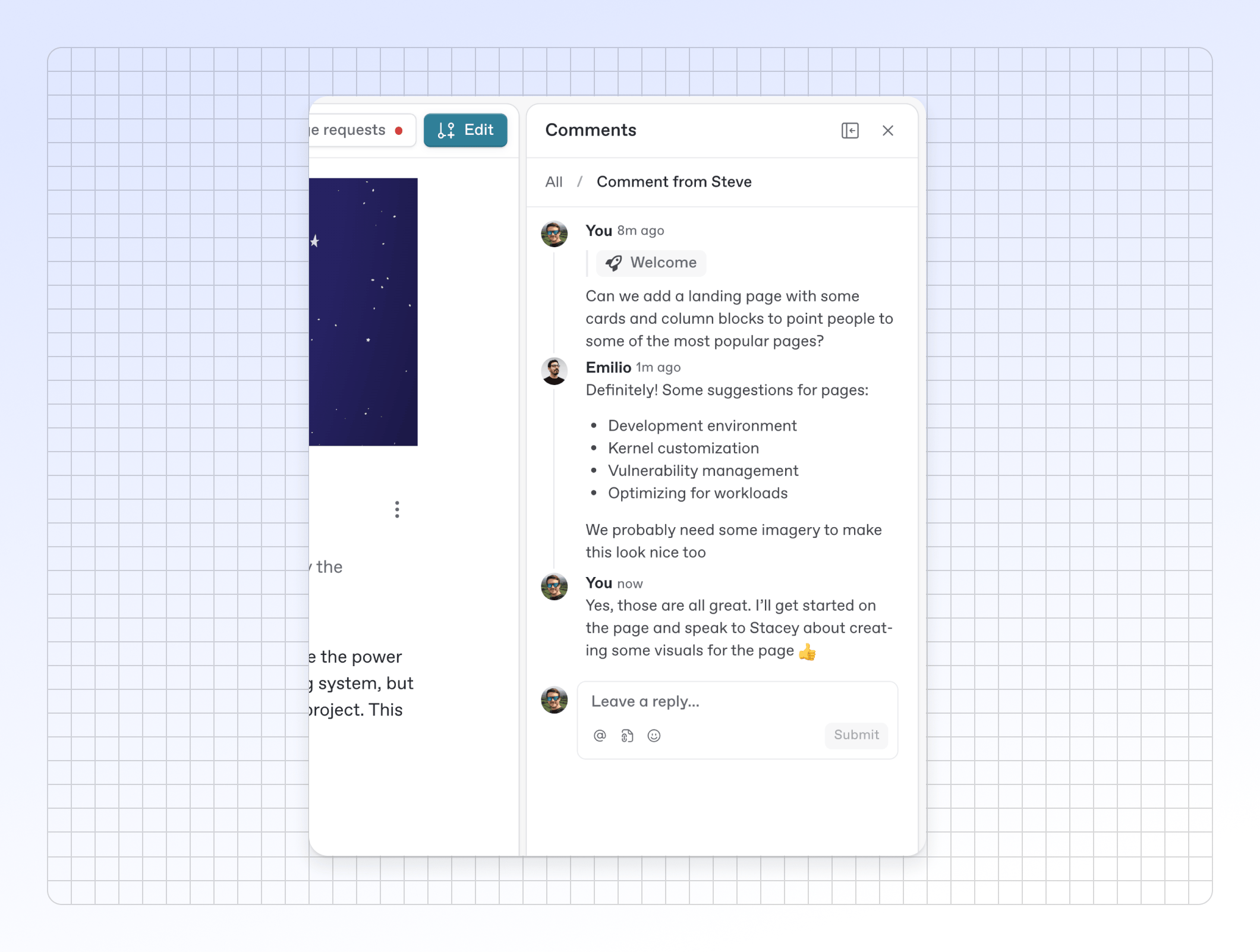
Adding a comment or reading comment threads will no longer open the entire comments side panel by default. You can now add and review comments using a new popover menu.
That means you can more easily add comments right alongside the content you’re editing, and check threads right in context.
And if you want to review all the comments on a page or just prefer using the side panel for feedback? You can still access it from the Comments menu in the header bar.
Improved
We’ve updated the palette you use to add inline links in your docs. You can still copy, edit and remove links using the palette, but when you edit the link you can now also edit the text that is linked from the palette.
Talking of palette improvements, we’ve made similar improvements to the annotations palette. When you add an annotation you can now edit the text the annotation applies to while writing the annotation — and you can easily remove annotations you no longer want with the Remove option.
We’ve made some improvements to Git Sync that should improve syncs globally for all users.
First, we now remove duplicate files that GitBook manages when content is identical during an import.
GitBook now cleans up the Git tree of all files that it manages, if they’re not used in the revision on export.
If a space admin tries to install a Git integration for an organization, and they don’t have the permission to do that, we now show a clearer message that tells them to contact their organization admin.
We now support OpenAPI specification slugs with periods in public URLs (e.g.
api.v2). This ensures that published URLs are correctly generated when using the OpenAPI feature to create reference docs.
Fixed
Fixed some issues that could arise when you delete a collection containing content that’s linked to a published site. We now re-parent these spaces to make sure sites aren’t affected — and tell you about it with a message in the confirmation dialog.
Fixed a small bug that should improve typing performance in the editor.
Fixed a bug that meant palettes would sometimes show a loading state inconsistently when you switched between them.
Fixed a bug that meant long URLs weren’t being truncated on hover within the editor.
Fixed a bug that was causing the page content to shift position when the page outline appeared in the editor (e.g. when you added an H1 or H2 title to the page)
Fixed an issue that prevented you from adding a page link block within a stepper block. Now you can add page link blocks as expected.
Improvements to change requests, site search, version history and more
Improved sidebars for change requests and version history, plus search improvements, expandable code blocks and more.
A better change requests panel
This release makes it easier for you to view and filter change requests in the sidebar within a space.
First, there are new filters that let you discover change requests you’re involved in more efficiently. For example, you can find change requests based on their creator or participants — or just see those that are awaiting review. Which means in a couple of clicks you can see all the change requests awaiting your review.

The top of the sidebar also shows a few shortcuts to some of these filters, allowing you to instantly narrow down long lists of change requests in busy spaces to just the ones you need.
Site search improvements
Search has had a few upgrades with this release, making it easier for your end-users to find what they need:
Sites now support type-ahead search queries — which means users will see relevant results even if they don’t finish the word they’re typing. For example, if you search for ‘reusab’ in our docs, you’ll see results for ‘Reusable content’.
We’ve also improved the search filters to make the UI less obtrusive. Filters are now accessible at the bottom of the search modal — with the option to filter by site sections and then variants, if enabled for a section.

Finally, two small things. First, you can now hit Esc to close the search window. Plus, AI search now has a nice little animation to make it clear it’s working on an answer — plus a back button to get back to the standard search.
Easier version history browsing
You’ll now see a specific time and date next to each entry in the version history panel, making it easier to find the version you want when browsing back in time.

Talking of going back in time, we’ve also improved the rollback confirmation message, to make it clearer what will happen.
Finally, we’ve fixed a bug that would reload the entire page when navigating between entries in the version history — now only the content of your page will refresh.
Expandable code blocks
You can now choose to make code blocks collapsed and expandable in your docs — perfect for when you have long code blocks that take up a lot of vertical space.
In the editor, simply open the block’s Options menu and enable Expandable. The block will show the first 10 lines of code, with a button to expand to show the rest. Here’s how it looks in practice!
Improved
With this release, we’ve made some nice improvements to our published docs.
In a tab block, if a user selects a specific tab and navigates away from the page, when they come back that same tab will still remain selected so they can pick up where they left off
We’ve also made tab block headings more responsive, so they’ll look and work better on smaller screens.
Finally, we’ve fixed a bug that meant opening an anchor link and then switching to another page would jump down the page to the same position as the anchor on the previous page. That no longer happens.
If you’ve added a file to a page, you can now quickly view or download the file from within the editor with a click using context-aware buttons on the file block itself.
We’ve improved the way OpenAPI pages display in the editor. Titles, pagination buttons and the OpenAPI banner are now aligned with the rest of the content, and the page outline uses space more efficiently.
You can now search through the reusable content in your space using a new search box at the top of the reusable content section of the table of contents.
You can now create a page group in any position within your space’s table of contents using the + button that appears when you hover over the gap between two pages.
We’ve added the option to add alt text to cover images within cards — so you can make your docs even more accessible.
Using inline elements — like icons, emojis, page links and mentions — is now easier thanks to an improved UI. You can now more consistently browse the menu with your keyboard and type to search for what you want.
Fixed
Fixed an issue that meant on some site slug inputs, the URL was unnecessarily truncated. Now you’ll see more of the URL in the box while updating the slug.
Fixed a bug that meant emojis would be slightly cut off when added to the editor — particularly in comments.
Fixed an issue that meant creating a multi-level domain (such as
staging.docs.example.comwouldn’t display the correct CNAME during the configuration process.We’ve improved the wording of our import panel to make it clearer that you can import content from another docs site using a URL.
Fixed a bug that meant some MCP requests weren’t working properly.
Fixed an issue with merge rules that meant outdated reviews weren’t considered a rule-passing criteria.
Fixed a bug that meant duplicating a space group didn’t duplicate the custom slug for that page group. Now it will duplicate the custom slug, as expected.
Fixed a bug that meant opening Settings from the organization menu in the top-left of the app would open your personal settings, rather than the organization settings.
New keyboard shortcuts, block duplication, colored inline icons and more
Quickly switch between paragraphs and headings, duplicate blocks with a tap, add colored icons to your page and more.
Faster heading and paragraph block switching
We’ve added a few new keyboard shortcuts that let you quickly switch a text block between paragraph, H1, H2 and H3. Simply click anywhere in the block you want to switch and hit one of these shortcuts:
Turn into a paragraph
⌘ + ⌥ + 0
Ctrl + Alt + 0
Turn into a heading 1
⌘ + ⌥ + 1
Ctrl + Alt + 1
Turn into a heading 2
⌘ + ⌥ + 2
Ctrl + Alt + 2
Turn into a heading 3
⌘ + ⌥ + 3
Ctrl + Alt + 3
We’ve been using it while writing this changelog and it’s great — especially when you forget to hit # at the start of an empty line and you want a header block.
Duplicate any block instantly
One more neat shortcut to speed up your editing workflow: you can now duplicate any block by either hitting ⌘ + D (on Mac) or Ctrl + D (on Windows), or by holding the Alt key and dragging.
If you use the shortcut, a duplicate of your active block will appear below. If you drag, you can place your block anywhere you like on the page.
And of course, it works for more than one block as a time, too — so you can select multiple blocks and duplicate them all with a quick tap.
Add color to inline icons
You can now select a color for inline icons when you add them to your content
This is great if you want to attract attention to certain parts of your page content — or if you just want an inline icon to match the color of your text .
There are six colors to choose from — and if your space is published on a site, you can also choose the primary and semantic colors for the site to align your icon perfectly with the surrounding text.
To change the color of the icon (or choose a different icon from the picker), simply right-click it in the editor.
Quote search for internal content
We now support exact phrase matching for internal search within GitBook.
If you want to find an exact phrase within your docs without bringing up similar matches in your search results, you can now add quotation marks around your text. Remove the quotation marks and the search will work the same way as before, highlighting close — but not exact — matches.
Improved
We now let you extend your trial by an extra seven days if you’ve already had a trial and return to GitBook to try it again.
When you create a new collection, you’ll now see a dialog prompting you to name it immediately.
If you’re adding a variant to your site — such as if you’re adding localized docs or docs for a previous product version — we’ve made the process more straightforward through your docs site’s settings page.
We’ve improved search results a little more:
First, your site search now sorts results within each section better before displaying them.
For in-app search, we now avoid showing default site space content from the same space you’re in, and we’ve fixed a bug that prevented OpenAPI pages from showing in search results.
Fixed
Fixed an issue with block selection that could make click-and-drag selection activate when your selection caused scrolling.
Fixed a bug that could sometimes cause AI search to return a “Something went wrong” error after loading the initial response.
Fixed a bug that meant that contributors who had updated the primary branch would sometimes appear as contributors in change requests in a space, even if they hadn’t directly contributed to the change request.
Fixed a bug that prevented a new comment from being displayed after reaching 100 comments in one change request or space.
Fixed a bug that would sometimes cause a crash if you were reviewing a change request that contained tab blocks.
Better migration support, improved search and more
Migration and import improvements, searchable reusable content & API specs, and a bunch of other improvements and bug fixes.
Migration just got easier
This month we’ve improved our import and migration tools.
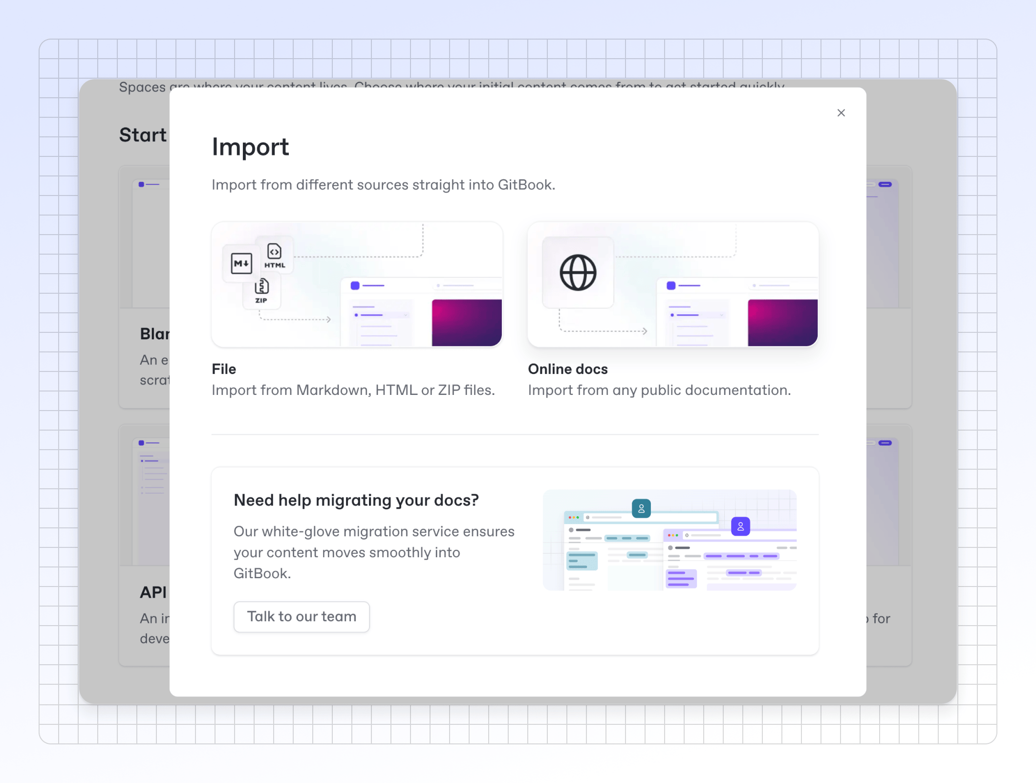
First, we’ve tweaked the UI copy on the import page to make it clearer that you can easily import your content directly from other docs platforms by simply pasting the URL of your current docs into GitBook.

We now also support .docx imports, making it easier to migrate your knowledge from Microsoft Word docs directly into GitBook. And we’ve added new imagery to the import screen to make it easier for you to find the option you need (and just make the UI look nicer).
We’re still working on making import and migration to GitBook even simpler, so stay tuned for more.
Search reusable content & API specs
We’re currently rolling out a new search backend that also indexes reusable content and API specs, making them easier to find when searching your content. We’re currently running through the reindexing process for every GitBook organization. Once that’s complete, we’ll start enabling it for all organizations.
Get started in empty spaces faster
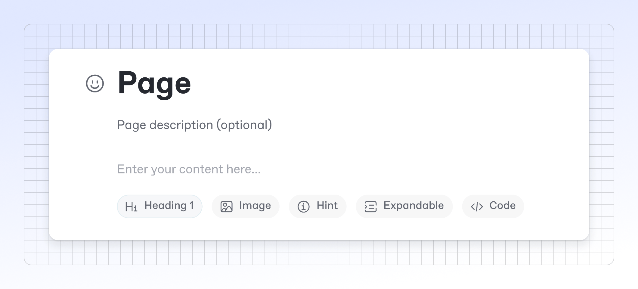
We all know how blank page syndrome can mentally block you when working on something new. To help you get started in an empty space, we’ve added some quick actions that let you instantly add a heading, image, hint, expandable or code block to an empty page with a single click.

We hope that this will kickstart your creativity while you’re working on new content — and we have more ideas to help with this that we’ll talk about soon.
Frame your images for visual clarity
Image blocks are great for showing off your product, but sometimes the image can blend with the background of your site, potentially confusing users.
To combat this, you can now add a frame to image blocks to give your images a consistent look and visually separate them from their surrounding content.
To add a frame, hover over the image, open the Options menu and enable the With frame toggle.
Here’s how framed images look in published docs:
Comment threads get a better home
When leaving feedback on a change request or page, we noticed that the comments panel could sometimes get a little long, with full threads displaying by default.
To combat this, we’ve removed threads from the full comments panel. Now, a button below the comment will show if it has any replies, and clicking the comment or the button will open the thread full in the side panel.

You can also click the new Expand side panel button to make the panel larger — perfect for longer or more detailed discussions.
Improved
When adding sections to a site in the Structure menu, you’ll now see the collection each space is a part of in the picker — making it easier for you to choose the right space.
We’ve improved the icon, title, and logo customization settings in the site customization interface. We’ve added support for light and dark mode icons, made the copy clearer, and updated the preview to be more consistent.
Fixed
Fixed the empty space between two blocks not being clickable. Now when you click a space between two blocks, it will select one block or the other.
Fixed a bug that made it difficult to delete headings from table cells.
Fixed an issue where navigating to a URL with a side panel open would cause the side panel to needlessly animate in view.
Fixed an issue with editor selection in Firefox.
Fixed an issue where a site that was published using share links was showing as unpublished.
Fixed a bug with comments that meant comments that started with an emoji would get a visible scrollbar.
We also fixed a bunch of other smaller import errors and bugs that occurred when importing big files, empty folders, and more.
Fixed an issue where a side panel would persist after merging a change request.
Nested section groups, new change request review options and more
We’ve added nested group support for site sections, allowing you to create hierarchical navigation — plus a few other improvements and fixes.
Nested section groups
Support for nested section groups is here! You can now add multiple section groups within a section group and give them all a title and icon. You can even mix sections and nested section groups together — the sections will display in a separate area within the group menu.

We’ve also made some small quality-of-life improvements to the section header. They include a new scrolling system that adds faded edges and scroll buttons when your sections are wider than the container, and some fixes that make sections and groups more responsive and better positioned.
A new toolbar when viewing your docs
You may have noticed a new toolbar that appears when you’re viewing your live docs site, or when viewing a change request preview in its own tab. This new toolbar gives you quick access to useful options with a click — and you can minimize it if you don’t need it.
In a change request preview, the toolbar lets you quickly leave feedback on the change request, view the live site, view the change request in the GitBook app or jump to the editor. This toolbar is only visible to people viewing the change request preview.

A similar toolbar now also appears on you live docs site, only for members of your organization who are logged into GitBook. So if you or a teammate visits your live site, you’ll see the toolbar and can quickly jump to the docs in GitBook to change settings, customize the site, check the insights or edit the content.
Note: The new site toolbar is not visible to anyone outside of your GitBook organization. It will not appear for your end-users when they visit your docs site.
Review process improvements
We’ve been working on improvements to the review flow to take advantage of the new side panel we recently launched.
We’ve tweaked the icon for adding reviewers from a cog (which took inspiration from GitHub) to a plus + icon — which makes it clear that it lets you add more reviewers.
We’ve also added a new system that marks previous reviews as outdated when you request a new one — or when you add a new review to a change request you’ve already reviewed. Plus, we’ve added a button that lets you re-request a review.
Improved
We’ve added support for pasting, parsing, and formatting one-row or header-only tables. You can now create a single-row table either in the editor or in Markdown via Git Sync, and it will display correctly in the editor.
When you highlight a URL in the app and choose to add a link to it, GitBook will now recognize the URL and auto-populate the link palette so you can quickly turn it into a link to that URL.
Fixed
Fixed a couple of bugs with text selection in popovers — such as the change request review dialog — and the Shift + click behavior across the app.
Fixed a bug that meant palettes didn’t automatically expand their width to show all of the copy within a list of options. Now all palettes should expand so you can read the copy for each option.
Fixed an error that could occur when opening a preview of your primary content.
Removed a tooltip that incorrectly said the Share button in a space could be used to publish that space as a site.
Fixed a limitation that meant conditional {if} blocks couldn’t contain full-width content. Now they can.
Fixed an issue that meant the bottom of the app would sometimes crop part of the way up the browser window when accessing the side panel for things like comments or version history.
Fixed an issue with site templates that meant new sites created from a template would have broken links.
MCP docs server generator, new search controls & more
You can now MCP servers so AI tools can interact with your docs, plus we’ve added new controls for users searching your docs, improved the page outline, and more.
Generate an MCP server from your docs
GitBook can now automatically create an MCP server for your documentation.
When enabled in your site’s customization options, you give your users the option to quickly copy a link to your MCP server and connect it to other tools. By doing this, your users can access knowledge from your docs in whichever platform they choose to connect to.
For example, if your user adds your docs MCP server to VS Code, they could quickly answer questions or add information from your docs into their coding environment via calls to the MCP server.
You can enable or disable this this in your site’s Customization > Configure menu, under Page actions. Once enabled, users can quickly copy a link to your docs MCP server from the Page actions menu and paste it into configuration sections on other platforms.
We’re adding this to our extensive list of other AI documentation optimizations — including llms.txt and llms-full.txt, easy Markdown page exports, and quick options to open pages in ChatGPT or Claude.
Search scope controls
We’re adding a new way to control search scope on your docs site.
Before, users could only choose the search scope if your site used variants for things like localizations or versioned docs. Now, your users can also choose which site sections to search within.
By default search will always show the best match — which is the user’s current variant and the default variant of every other section. They can choose to only search in your current section, or broaden the search to include all variants across alls sections.
No matter what, GitBook will automatically show the right set of buttons to make it as easy as possible for your site’s visitors to find what they need. For example, in our own docs we only show two buttons — because we have no variants.
It’s also worth noting that we no longer include language variants in the search scope. We assume most users won’t want to search multiple languages, and results in other languages can be confusing and take up space in the results section.
Page outline improvements
We’ve made some small but useful improvements to the page outline in our editor.
First, we’ve separated the On this page title from the outline itself and added an icon to make it easier to find. Plus, the title now stays sticky, even on long pages with lots of sections.
We’ve also improved the scroll behavior for longer pages. If the page outline is scrollable, it stays in sync with the page’s scroll position, keeping the active item at the top as you scroll.
We think this will make scrolling through your content — especially on longer pages — much easier.
Improved
We’ve updated the information shown when a change request is blocked from merging by merge rules. If you open the change request’s Overview panel, it’ll now show whether merging is blocked or allowed, with a list of rules explaining why.
You’ll now see a new option to share your newly published docs on social platforms, so you can immediately promote your docs once they’re live!
We’ve add the option to filter site redirects to make it easier to manage a large number of redirects in the app.
We’ve made some subtle (but nice) improvements to the inline palette in the editor. So when you highlight some text the new palette has improved shadows and a slightly smaller size so it blocks less of your content.
Fixed
Fixed the way the emoji picker displays in the change request review popover.
Updated the icon for merge rules.
Fixed a bug that meant the Merge button sometimes didn’t display on an open change request if there were blocking merge rules. Now it will show, but be disabled.
Fixed an issue that meant adding a heading to a hint block would also incorrectly create an anchor link for the header. This no longer happens.
Fixed a bug that meant selecting something in a menu palette would sometimes cause the palette to jump to a different position. Now the position remains stable when you select items.
Fixed a bug that meant the Copy option wasn’t working for AI responses in the in-app Ask or search palette.
Fixed a bug that meant sometimes, when you created a new section group in your site’s settings, it would add the group to the top of the site structure, rather than the end. Now it will always be added at the end.
Merge rules, improved language selection and more
New ways to control when change requests are merged and by whom, plus improvements to localization support, change requests and more.
Merge rules
With this release, we’ve introduced merge rules for change requests.
Merge rules let you define specific requirements that must be met before a change request can be merged. You can set rules within each individual space, or set rules that apply across your entire organization, which you can then override within a single space if needed.
We’ve made it easy to configure with a bunch of presets to match your team’s requirements — from requiring the change request to have a subject, to requiring review from specific members. You can combine rules in any way you like to build more complex workflows, as well as write dynamic expressions using the same language as for adaptive content.

When a change request hasn’t met all the merge requirements, the Merge button is disabled and a tooltip explains why it can’t be merged.
We’re rolling this out starting with early access users today. It will be available for everyone on the Pro plan soon. This feature has been requested a lot recently, so we’re super happy to ship it!
Improved language selection
If you’ve used translations to localize your site into different languages, we’ve improved your users’ experience when browsing your docs.
A new language picker now appears in the top-right of the screen, allowing site visitors to select their preferred language — and that language will be maintained when navigating between site spaces and within search results.

We’ve also added language options to the Structure section of your docs site settings, allowing you to quickly and easily select the UI language for your docs site as well.
Change request descriptions
Change requests just got more powerful, with a new sidebar that lets you add a description and easily view and add reviewers.
Open the Overview sidebar in a change request and you can see its status, quickly copy a link to it, add a description and manage reviewers. The UX should be familiar to anyone who uses GitHub.

This will become especially useful with the upcoming launch of Docs Agents, but it also allows you and your team to add more context to change requests and more easily manage your review flow — especially when paired with merge rules.
Vertical alignment in column blocks
You can now vertically align content in a column block. It’s ideal for creating centered or bottom-aligned content — such as when building landing pages or adding context to an image.
Fit and fill options for card images
You can now choose more display options when it comes to card images.
Previously, images would automatically be cropped to either 16:9 or 1:1 depending on your readers’ screen size. But that meant your images could sometimes be cropped incorrectly, and portrait images would never display in full.

Now, you can choose between three options:
The image crops to 16:9 or 1:1 as before.
The image stretches to fill the entire box.
The image displays in full within the constraints of the box, with your primary color filling any background space.
Improved
We’ve made it easier to invite new members to your organization in bulk. Simply add the email addresses of the users you want to invite to the box, separated by commas, to add up to 100 users at a time.
We’ve tweaked the search results for localized versions of published docs. Now, if a user is viewing your docs in another language and they use the search bar, instead of seeing results in both their selected language and the site’s default language, they’ll see results only in their selected language when available.
If you link a new organization to your email domain, GitBook will now automatically use the email domain’s favicon as the organization’s logo. And when you create your first site in that organization, GitBook will automatically use the same favicon as the site’s icon.
The Export as PDF and Edit on Git options now appear in the Page actions menu on your published site. And the settings to toggle them on and off are now in Customization > Configure along with the other Page actions options.
We’ve made a few small improvements to the page outline.
First, titles within Stepper blocks will now appear in the page outline, allowing users to jump quickly to the step they need.
Second, we’ve fixed a bug that meant links in H1, H2 and H3 headers wouldn’t appear in the page outline. Now the full heading will appear in the page outline, including words that are links.
Finally, we’ve added column headings to the page outline, so that all headers will appear in the page outline.
We’ve added an Editor tab to your site’s dashboard, which instantly navigates you to the default site space ready to start editing.
If you use OpenAPI blocks, GitBook now renders OpenAPI schemas properly as JSON in the Markdown version of a page.
We’ve improved the billing page in the app to make it easier to see what’s included in your subscription and to make changes.
Headers now support bold and italic, allowing for more formatting options.
Fixed
Fixed a bug that meant links in H1, H2, and H3 headers wouldn’t appear in the page outline. Now the full heading will appear in the page outline, including words that are links.
Fixed a bug that prevented you from adding images to a table cell.
Fixed a bug that meant holding Shift and clicking in a code block would select the entire block, instead of selecting the text within the block. Now it works as expected.
Fixed a sizing issue that meant inline mentions that included non-square icons (such as ⌨️) were aligned too close to the adjacent text.
Fixed an issue where Git Sync progress percentages were exceeding 100, because no matter how hard it tries, Git Sync cannot realistically give 110%.
Fixed a bug that meant files you renamed in your Git repo didn’t sync into the GitBook editor.
Auto-updating translations, AI Assistant improvements and more
Introducing an all-new, super simple way to localize your docs and maintain the translations — plus smaller improvements to Assistant, better LLM-ready docs and more.
AI-powered, auto-updating translations are live

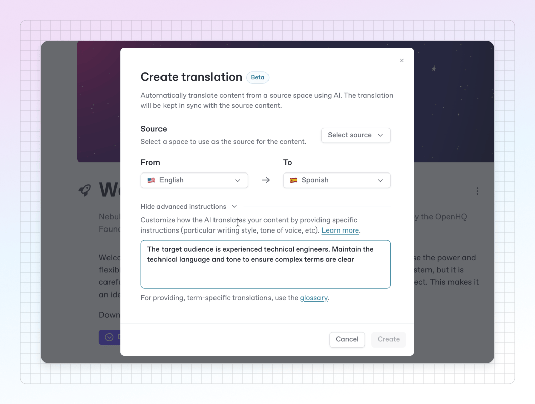
You can now automatically localize your entire docs site into 36 languages at the click of a button using our new Translations feature.
Translation uses AI to automatically translate your docs content into whichever language you choose — and will automatically update those translated versions of your docs whenever you make a change to the primary language version.
Simply choose the space you want to translate, select the source and target languages, and let AI do the rest. You can add specific instructions, such as a tone of voice or writing style, right from the modal. And you can also add a Glossary for individual languages if there are certain words or phrases that you want to be translated in a specific way across all your translations.

Once created, these translated spaces can be easily added to your docs as a variant, and any time you make a change to the original source space, the translated version of the space will auto-update following the same instructions and glossary.
That’s localization, simplified. Find out more in our docs!
GitBook Assistant improvements

After GitBook Assistant’s launch a few weeks ago, we’ve been making a bunch of small refinements to the way that it answers questions and helps your users.
First, we’ve upgraded the model, allowing for faster answers and more optimized outputs. We’ve also refined the prompt even further, which means users will get better, more accurate answers with better references.
Plus, we’ve added new auxiliary prompts to improve the quality of the recommended questions and the follow-up questions that appear in the chat after each response. You should notice that the recommended questions are shorter and more interesting, while follow-up questions will be more on-topic than before.
We’ll have some other, larger improvements for Assistant soon — including new ways to integrate it into your product. Stay tuned!
Russian language support
We’ve added an interface localization option for the Russian language in the published docs interface. When enabled in your site’s Customization menu, the interface of published docs will be translated into Russian.
Thanks to Rex Gratidian for contributing this localization. If you want to contribute to improving GitBook’s published docs, please head to our GitHub repo to find out more!
Better Markdown support for your LLM-ready docs
We’ve made a big improvement to the way our API returns Markdown for a page, so that it now outputs the content of reusable blocks and OpenAPI blocks just like other content.
This is super important, as the .md version of a URL is useful for LLM ingestion — so making sure all of your docs are LLM-friendly is vital. Now your GitBook docs are super LLM-ready, right out of the box.
Light and dark card images
You can now apply a light and dark mode image to any card — just like other images in GitBook.
To do this, open the Card options menu and choose Cover > Edit cover > Add cover for dark mode. The correct cover image will show automatically depending on the user’s settings.
We’ve also added the option to create cards that only feature a cover image. So you can remove all other fields within a card and simply show a grid of images, if you like.
A bunch of editor improvements
We’ve been working on a ton of smaller improvements across the editor, including:
More consistently centered content within the editor across all screen sizes, to stop content moving around when you open or close different sidebars in the app.
An improved page outline which stays sticky next to the content editor. We’ve increased the visibility conditions so you’ll see it more often, simplified its logic, and added stepper blocks to the outline so you’ll see each step listed alongside other section headers.
We’ve fixed diff view, which wasn’t showing the diffs on some smaller screens. Now you’ll see diff markers by each block that’s changed.
We’ve also fixed a bug that meant the comments button could be cut off on smaller screens. Now it will appear as expected, ready for you to give feedback.
Improved
We’ve added URL query parameters for search (
?q=) and the AI search/GitBook Assistant (?ask=). So you can add search topics or questions to a docs URL (e.g. gitbook.com/docs/?ask=What+is+GitBook?) and have the search or GitBook Assistant open automatically with a query pre-filled.If you’re viewing a space’s Preview and then click Edit, it now opens a new change request and automatically redirects you to the Editor view so you can immediately start editing. Before, it would maintain your Preview view.
We’ve improved the UX of the Annotate option in the inline palette when editing. There’s a new icon and tooltip to make the difference between annotations and comments clearer.
We’ve improved the way that moving list items around works. Now, when you drag a list item into a new block, it will keep the same list type. But if you drag a list item into another list of a different type, it will automatically switch to that new list type.
The site settings and insights screens now make better use of space.
We’ve changed the way that you copy anchor links in the editor. Now, when editing a page you can edit or copy an anchor link by opening the Block options menu
and choosing the Link option. If the page is in read-only mode, you can copy the anchor link by clicking the # to the left of the title — just like you do in the published version of your docs.
Fixed
Fixed an issue that prevented you from making inline code bold or italic — that’s now possible again.
Fixed a bug that hid the ‘show/hide table of contents’ button behind the header image if it was enabled for a page.
Fixed a bug with non-default variants that would resolve incorrectly if there was a conflicting deprecated path.
Disabled the option to turn a single line in a list into reusable content, as doing so would delete the line.
Fixed a crash in the Insights table when navigating through pages aggregated datasets with custom sorting.
Fixed an issue in the editor that meant cards with different lengths of content would appear at different heights in the same block. This didn’t align with the published version. Now cards will all use the same height as the card with the longest content, just like in published content.
Fixed an issue with block selection that would happen when you selected a code block with a title.
Fixed a bug that was causing the editor to refresh whenever you changed a page title.
Emojis added to titles via our inline emoji picker are now listed in the ‘On this page’ section on the left.
Fixed an issue that meant updating site customization could result in an error message.
Fixed a bug that meant setting a cover image for a card could do nothing, or in some cases could remove cover images from other cards.
Fixed an issue that meant users couldn’t install integrations in the site or space screens due to missing permissions check in the backend.
Fixed a bug that meant when deleting the last card or row in a table, the table block disappeared but the wrapper remained, which made it difficult to add new blocks to the page.
GitBook Assistant, improved insights, new AI actions and more
This release introduces a supercharged new AI assistant, improved insights options, a new wider page width option that’s perfect for building landing pages, and much more.
GitBook Assistant — knowledge from your docs and beyond

As part of yesterday’s adaptive content launch we also introduced GitBook Assistant — a powerful new AI experience for your docs.
Assistant is a big step up over our previous AI search functionality. While our old solution was fast and gave end-users accurate answers based on your docs, GitBook Assistant offers a new chat-based UI, seamless integration with adaptive content, and the option to connect with MCP servers to provide better answers with more context.
As well as using agentic retrieval — which gives it a deeper understanding of user intent, and more accurate responses — it’s also integrated with adaptive content. So it can use knowledge about an individual user to give better, more tailored answers.
It can also connect to other sources via MCP servers, meaning GitBook Assistant can pull information from different sources and use that information to answer questions with even more context.
Read more in our announcement post, or head to our demo site to experience its adaptive content integration.
Time ranges and AI response rating in insights
We’ve made two big improvements to our built-in insights.
First, you can now choose time ranges when analyzing site data. So you can set custom time periods to review, or compare site data between two identical periods in any degree of separation.

Plus, you’ll now also see the ratings that users are giving your AI responses within the Insights panel — along with the question they asked and how many people asked similar things.
This is ideal for identifying common questions that are getting poorly-rated answers, so you can fill the gaps in your docs and provide better answers to your users.
Page actions
Your docs now feature a handy Page actions menu on each page, allowing your users to quickly ask GitBook Assistant a question, view or copy the page content in Markdown, or open the page in ChatGPT or Claude to pre-load a prompt.

Semantic colors in the editor
You can now use the semantic colors you define for your docs site — which are used to change the color of hint blocks and announcement banners in your docs — within the content itself.

If you’ve set semantic colors for a docs site and are editing the content of that site in a change request, you can now use the inline palette to change the text color and background to use the Primary, Info, Success, Warning or Danger colors you’ve defined for that site. These colors will sync with the semantic colors in your docs to bring everything in line.
New “Wide” page width option
We’ve added a new Wide page width option, which is perfect for creating eye-catching landing pages.

To enable the option, open the page you want to widen and open the Page options menu that appears when you hover over the page title.
There, you can set the page width to Wide, which will automatically expand all blocks that can be expanded, and align the rest of the blocks within the bigger container.
Head over to our demo site to see how it looks.
Page metadata
GitBook automatically creates page metadata — including when the page was updated and who updated it. These are both shown by default in the editor, and ‘Last updated’ also appears on published pages.
Now, you have the option to disable that metadata on a per-page basis. Open the Page options menu and in the Footer section disable the Page metadata option to hide the data from readers.
OpenAPI spec validation improvements
We’ve made some improvements to our OpenAPI specification validation process. These updates should identify issues with the spec file earlier, so your docs stay consistent and reliable for your readers.
If you’ve experienced any issues with your OpenAPI spec in GitBook, try pasting it into http://editor.swagger.io/ to check for formatting or structural problems. And if you’re still having trouble validating your spec, feel free to reach out to our support team at support@gitbook.com.
Improved
You can now add comments on individual table cells, allowing for better feedback when collaborating on complex pages.
We’ve added some new shortcuts to table blocks. You can now hit ⌘ + / (Or Ctrl + / on PC) to open the Row options menu, and hit ⌘ + - (or Ctrl + - on PC) to delete the row containing the currently-selected block.
We’ve made locked live edits the default editing mode in new spaces, which means the default workflow in GitBook will now be using change requests. This is already the case for all published content, and brings us closer to the Git workflow. For now, you can toggle live edits on a space to re-enable live editing if needed.
We’ve reduced the padding in inline code to make it feel a little more compact and in line with the rest of your content.
We now show icons in the table of contents that denote when a page is hidden and/or not indexed in search. If a page is both hidden and not indexed, we show both icons together to avoid taking up too much space in the TOC.
The spacing in the table of contents now makes it clearer when spaces are part of groups or separate from them. Before, spaces directly below page groups would be so close to the group that they appeared to be part of the group.
Fixed
Fixed a bug that meant holding ⌘ or Cmd and clicking in the sidebar was causing the app to freeze.
We’ve removed TypoScript from the code syntax dropdown menu as it was confusingly similar to TypeScript and far less popular.
Fixed a bug that meant drawings weren’t updating immediately in the editor when you made changes to the drawing itself.
Disabled the shortcut to activate search within the GitBook app, as it was causing conflicts with other system shortcuts for some users.
Fixed a bug that meant hitting Esc while in the emoji selector didn’t just close the menu, but also selected the current block.
Fixed an issue that meant your AI writing prompt would be lost if AI was used at the bottom of a page — and another that meant very long AI writing prompts could grow past the total height of the page.
Fixed a bug that meant empty pages would sometimes display at full-width even if you didn’t select it.
Variables, redesigned search, better diff view and more
Create and add reusable variables to your docs, plus a redesigned search experience for your published docs, and other editor improvements.
Introducing variables in GitBook
With this release we’re introducing variables.
If you repeat the same name, phrase or version number multiple times within your content, you can create a variable to help keep all those instances in sync and accurate — which is useful if you ever need to update them, or they’re complex and often mistyped.
You can create variables scoped to a specific page or a specific space, and then use them as many times as you like within a space by adding inline expressions.
For example, you might want to add variables such as:
product_nameversion_numberemail_supportaccount_type
By using variables like these, you could easily update a product name or version number across your entire docs, simply by updating the variable itself.
To view, add and edit your variables, click the Variables icon in the header bar within a change request.

You can then use a variable to your content by adding an expression. Hit / and choose Expression from the list, then double-click the expression to open up the expression editor where you can choose the variable you want to add.

Variables are super useful on their own, but become even more powerful when paired with adaptive content. We’ll talk about this combination more in the coming weeks.
Search gets a new design on docs sites
We’ve improved the search experience for published sites, with the Ask or search… bar now holding the search experience in one place, without overlapping all of your content.

Before, the search panel would sit centrally over all of your page content, blocking users from seeing it while they searched.
Now, users type directly into the search bar — which holds both the standard keyword search and the GitBook AI search experiences.
Diff view for title and description
Diff view helps you and other reviewers see what’s been edited within a change request. And now it also shows when a page’s title or description has changed!

Better breadcrumbs when editing a space
We’ve improved the breadcrumbs in the editor to make it easier for you to quickly access site settings directly from a space.
When you’re editing a published space, you can click the icon of your site in the top-left of the editor to open a new site menu.

Here, you can instantly access your main site overview, insights, customization and settings. You can also visit the site or copy the site’s URL, saving you time clicking into different parts of the GitBook app.
Not only does this make it easier to jump to important areas right from your content — it also saves space in the header — and we think it looks great, too.
Improved
We’ve improved the flow around adding new sections to a site. Adding a new section will now open a menu that lets you choose different kinds of content — whether you want to use an existing space, important content or start from a blank page.
We’ve added an animation to the site dashboard to show the your site preview is loading. Before it showed a grey square that looked like an error — now it’ll show a simple loading animation to show that something is happening.
If your site is published using share links, it’s now easier to view your site from the dashboard. We’ve added the share links themselves to the dashboard so you can quickly click one to jump to the published content.
We’ve improved the way that GitBook handles OpenAPI specifications when you first upload. It will now detect content types and the proxy worker to serve specs with the correct types.
If you choose to disable web-crawler indexing on a page (for platforms like Google and ChatGPT), you’ll now see a small icon next to the page title in the table of contents with a tooltip to indicate it’s not being indexed.
When you’re viewing a merged change request, there’s now an clear and easy way to get back to your primary content. A new button in the top-right of the window takes you right back so you can see the current version of your space.
We’ve restored the option to add relative links to the table of contents. That means you can link to other pages or spaces from the TOC, and they’ll resolve into proper links in your site. But if you update the location or slug of the linked page or space, the link in the TOC will update automatically so you won’t need to edit it manually.
The Share dialog has improved within a space. Along with a new button and tooltip, along with a new option in the Space actions
menu.
Fixed
Fixed a bug that meant LaTex characters would be lost when parsing Markdown or HTML. They should now render correctly in the editor.
Fixed a couple of issues with Git Sync that meant the progress bar wasn’t updating properly, and the installation screen wouldn’t show the correct state.
Fixed an issue with tables nested inside expandable blocks that meant table blocks couldn’t be selected or edited using the keyboard.
Fixed a bug that was causing the ‘conflict view’ — aka the view that appears when an updated change request has conflicts with the main branch — to crash.
Fixed a bug that meant @ mentions in comments weren’t working. Now they’ll function as expected!
Fixed an issue that meant relative links to other spaces or pages within reusable content would not resolve when the reusable content was added to other spaces. Links should now work as expected.
Fixed an issue that deselected blocks and scrolled up to the top of the page too easily when clicking outside the block palette.
Fixed an issue that meant page descriptions would be overwritten by page titles.
Fixed a bug that sometimes caused the page to scroll to the top when exiting the images menu or an image caption
Custom code fonts, make your API spec public and more
You can now upload your own custom font for code blocks, create new sites more easily, make your API spec public and more.
Set a custom monospace font for code blocks
You’ve been able to upload a custom font for your docs for a while — but now you can do the same for a monospace font for code blocks and inline code.
To change your code font, head into your site’s Customization panel and select from the Monospace font dropdown menu.

Share your OpenAPI spec from your docs
You can now choose to generate a publicly-accessible URL for your OpenAPI specification once you’ve added it to GitBook — as long as your specification is marked as public. The URL will always point to the latest version of your specification.
With GitBook hosting your spec, it’s easy to use it both to instantly generate docs, and in external OpenAPI-based tools like Stainless, Postman or others.
Head into the OpenAPI section in the GitBook sidebar and find the API you want to make public — then simply hit the toggle.
Improved notification emails
Last month we improved a few of our emails with a better design and more context about the subject — and we mentioned we’d be doing the same to more emails soon.
Well, now we have! Our emails now all use this new improved style ✨
Simplified site creation flow
When you create a new site, you’ll now see a dashboard that’s more tailored to what you want to do.
First, you’ll see four large options at the top to offer you different ways to add content to your site — including Git Sync, OpenAPI spec upload, and import options.
Below that, you’ll also see four site templates to help you get started with an all-new site faster by adding content to an established structure.

Finally, you’ll see a list of all your existing content within GitBook, along with a search bar, allowing you to quickly add existing content to your site and publish with a click.
These changes should make it easier to create an publish your site fast 🏎️💨
Improved
Table blocks and expandable blocks now support diff view more effectively. Before, editing any part of a table would show the entire table as being deleted and a new one created in diff view. The same went for changes in an expandable block. Now, the table or expandable shows as edited and the individual changes are highlighted within the block.
We’ve added icons to diff view to make diffs accessible for color-blind users Make diff accessible to colour-blind users.
You’ll now see a new option to visit the a published page’s live version in the Actions menu
for individual page. This is especially useful for hidden pages that are otherwise difficult to access via URL.
We no longer show captions on image and code blocks in the editor by default. Captions added a lot of white space in the editor, meaning big gaps between content if you didn’t want to add a caption. Now they won’t appear by default, but you can add one by hovering the image and clicking Caption in the menu that appears.
You can now use keyboard shortcuts to insert new rows in tables. Hit Enter ⏎ to move down or Shift ⇧ + Enter ⏎ to move up between rows. Then hit Option ⌥ + Enter ⏎ to add a row below, or hit Shift ⇧ + Option ⌥ + Enter ⏎ to add a row above.
You can now convert H1, H2 and H3 heading blocks to other heading styles by adding # at the beginning of a row.
We’ve added a confirmation button to the annotation and Math popover when adding them inline. Your changes are saved automatically, but it helps reassure users that their changes are saved.
We now check that uploading files are compatible with inserting into GitBook before you upload them to avoid wasted uploads.
We’ve updated the Docs sites screen to make it easier to find and open your site.
Fixed
Fixed an issue that meant the comments button in a change request would show the wrong count.
Fixed an issue that meant removing the dark mode logo for a site would also remove the light mode version of the logo. Now it will only remove the dark mode logo as expected.
Fixed a bug in the Layout section of the Customization menu that meant it was sometimes impossible to select certain spaces or pages to link to.
Fixed an issue that was causing the Markdown formatting soft line breaks to be incorrectly parsed in Git Sync.
Fixed a bug that made the code block toolbar editable.
Restored the ability to reinstall integrations on every space after uninstalling on one or two spaces.
Fixed a bug that caused emojis to be removed from table of contents when syncing from GitHub
Fixed a bug that meant hidden pages were hidden from everyone in the GitBook app and could only be seen by those with editor permissions or above within change requests. Now, members with editor permissions and above will see hidden pages in the table of contents.
Fixed an issue that meant hitting Shift + Enter would not insert a new line in a table cell.
Fixed an issue that meant the number of commenters you could filter by in the Comments side panel was limited to 10. The new limit is 50.
Fixed an issue that meant some images were being presented at a larger size than their original dimensions when clicked in GitBook. The images will now only appear at their original size at a maximum.
Fixed a bug that caused images that you chose to ‘Quick look’ in the Images modal to appear behind the modal rather than in front of it.
Performance upgrades, llms-full.txt and .md support, text alignment and more
Your docs sites load faster and support llms-full.txt and .md for LLM ingestion — plus you can now add icons to buttons, center- or right-align text on the page, and much more.
Your docs site just got faster

Over the past few weeks we’ve been slowly rolling out a new platform for our public docs. It’s faster, more performant, and it prepares us for our future plans regarding adaptive content.
The great news is that this new, improved platform is now live for everyone.
We rolled this out slowly because we handle 150 million requests on docs hosted by GitBook every day, and each one makes multiple requests to our API. The slower rollout meant we avoided downtime caused by overloading the API with requests, and means we can now optimize how we generate pages to improve loading times.
That means your users will get improved performance in your docs, and there are a few other benefits as well…
llms-full.txt and .md support for LLMs
Our new docs platform means your docs now automatically create an llms-full.txt file, which includes all of the content on your entire docs site.
llms-full.txt is a new proposed standard for making web content available in text-base formats that are easier for LLMs to process. You can access the llms-full.txt page by appending /llms-full.txt to the root URL of your docs site.
The llms-full.txt file provides a comprehensive collection of all your site’s content in Markdown formatting. With this file, you make it easier for LLMs to efficiently discover and process your documentation content.
You can also now add .md to any page’s URL in the browser to see the content of that page rendered in Markdown.
This is great for LLMs as well, which find it much easier and more efficient to process Markdown than a full HTML file with all the styling your docs site page includes.
Add icons to your inline buttons
Last month we added inline buttons to docs, and last week we added inline icons. Now, we’re combining the two!
You can now add an icon to any button you add to your docs, allowing for more customization, and helping you attract more attention to your CTAs.
Center align headings, paragraphs and inline items
Want to build a polished landing page, add some more structure, or even make your docs the homepage for your entire product? That’s just got easier with alignments in GitBook.
You can now align header and paragraph blocks to the left, center or right of your page, allowing for more flexibility when you’re designing your content.
Add centered titles to build a clean landing page. Right-align an image or some buttons as a CTA to read more. You can even combine alignments with our new column blocks and button icons to create variations on specific layouts you like.
Select all just got better
When you hit ⌘ + A (Mac) or Ctrl + A (Windows) to Select all within certain blocks, GitBook will now first select the contents of that block. You can hit the same keyboard shortcut again to select all the content on the page.
The blocks that use this logic are tab, stepper, code, column and hint blocks.
Improved
We’ve improved page position and selection when switching between pages. You’ll now jump back to the place on the page you were last and any selected content will remain selected, allowing you to jump quickly between pages to check details without needing to scroll.
We’ve added heading options (H1/H2/H3) to the top level of the Block options
menu for paragraph and heading blocks to make it easier to switch between different headings when creating or editing docs.
When you hit ⌘ + A (Mac) or Ctrl + A (Windows) to Select all within some blocks, GitBook will now first select the contents of that block. You can hit the same keyboard shortcut again to select all the content on the page. The blocks that use this logic are tab, stepper, code, column and hint blocks.
We’ve made it easier to apply for the Community plan through your site’s settings. You can now apply for the plan directly in the settings screen, and it offers a dedicated space for Community plan users to submit their site for ads approval.
When you create a new page, the focus will immediately be on the title. It’s a small change, but it should improve your editing experience when you add new pages to your docs!
Fields within cards now have an Actions button
at the end of each field, allowing you to complete actions like adding or removing entries or deleting the field.
In published content, you can now collapse page groups when browsing pages within those groups, and when your click between the parents the page you previously had opened will automatically open without the parent expanding. This should help save vertical space in the sidebar
Fixed
Fixed a crash that could happen to the comments side panel if the user tried to open it without having commenting permissions.
Fixed a bug that meant GitBook AI would sometimes process text in the wrong order when rewriting a group of blocks.
Fixed an issue that was causing broken links to API specs in GitBook when you set up Git Sync. Now you can properly link to API specs when your content is synced to GitHub or GitLab.
Fixed an issue that meant the wrong users could sometimes be shown as merging a change request. Now, the person who merges a change request will always be shown in the version history.
Fixed a bug that prevented users who had been given edit access at a collection level to create spaces within that collection.
Fixed a crash that could happen when a number field in a table was null or undefined.
Fixed a bug that caused some jumps in the editor.
Fixed a bug that meant a toast saying “Uploading file…” would sometimes never dismiss and remain on the screen.
Fixed a bug with drawing blocks that meant they wouldn’t update after an edit. Also fixed a separate bug that meant copying and pasting a drawing block would sync them so updates to one would sync to the other. Now they are treated as separate blocks.
Column blocks, inline icons and a bunch of smaller improvements
We’ve added a new block type — columns — plus inline icons, a better site structure management experience and more.
Columns: a new way to display your content on a page
Introducing column blocks!
You can use column blocks to add two blocks on your page, side-by-side. It means you can combine two of almost any block you like alongside each other to create some powerful combinations
For example, you can combine an image, some text and a few buttons to build a nice block for a landing page. Or you could add some extra context to your code blocks, diagrams or other content within a guide or docs page.
When you add a column block, you can add content to either side of the content by hitting / and choosing the block you want to add from the palette.
You can also adjust the width of the two columns using the grabber in the centre of the block. Drag it left or right to adjust the interval of the column divider — the column widths will adjust automatically.
Add inline icons to your docs content
We’ve added a new inline element that you can use in your docs — icons!
You can now add icons anywhere on your page, giving you more options when create titles, lists and much more. Head to the docs to learn more.
A simpler way to manage your site’s structure
This week we’ve improved the Structure section of your site settings, making it easier to change settings for individual site sections.
You can now see all of your site sections and groups on the left of the menu, and click on any option to view its options. On the right-hand side, you can edit options like the section’s title, icon, description and slug.
More context when Git Sync encounters issues
Before, when Git Sync encountered an error, the message that appeared in GitBook didn’t give much context about the issue.
We’ve improved the messages — they now include more information about the error so you can solve it before you retry your sync.
Improved
We’re renamed visitor authentication throughout the app and our docs — the feature is now called ‘authenticated access’. This new name better reflects our approach to authentication as we prepare for adaptive content.
We’ve revamped the dialog screen when creating new spaces — making it easier than ever to add new content or import existing docs into GitBook.
You can now remove reviewers after you request a review for a change request. Simply open the Overview side panel in your change request to see the list of reviewers, then open the Actions menu
and choose Remove reviewer.
We’ve improved the way that you edit and handle inline buttons in the editor. You can now double-click or right-click to edit the button’s settings, and doing so will open a new modal that makes it easy to change the settings in one place.
We’ve also simplified the dialog that pops up when you publish your site, to give you a nice big view of your published site and a link to visit it.
Fixed
Fixed an issue where space-level integrations were shown on the site screen (and vice versa), which could lead to errors if you selected them in a place they shouldn’t be.
Fixed a visual bug with the redirects modal that caused a drop-down menu button to appear wider than the modal when choosing a destination space with a very long title.
New customization styles, email improvements, dark mode cover images and more
You can now add circular buttons, choose flatter design elements, and select cover images specifically for light and dark mode in GitBook.
New depth and circular corner styles in site customization
We’ve added two new style options to customization settings for your docs site.
Firstly, we’ve added a new Depth style setting in the Site styles panel, which lets you choose from two depth options. ‘Subtle’ is the default style, and adds some shadows and elevation to UI elements like buttons. The new ‘Flat’ style removes all shadows and elevation for a clean, simple look.
We’ve also added a third corner style in the same panel. Along with our existing ‘Straight’ and ‘Rounded’ options, you can now also choose ‘Circular’. This will affect UI elements such as buttons, TOC highlights, site sections and more.

Cover images get dark mode support
Your page cover images no longer have to work for both light and dark mode simultaneously. Now, when you add a cover image to a page, you can also upload a dedicated version of the image to display when your docs are viewed in dark mode.
To do this, simply hover over the cover image in the editor and open the Options menu . Here you can choose Replace image and select a new image for light or dark mode.

New notification email design
We’ve improved the design and information included in the notification emails you receive when someone comments on a space or a change request your own.
The new design includes the name of the change request or space, and the page, instantly giving you more context without needing to click through and read more.

We plan to roll out similar improvements to our other notification emails soon — stay tuned for more news on that!
Improved
We now make sure we bust the cache whenever published content changes — which means you should see updated content right away when you merge a change request.
It’s now easier to deselect a selected block. When a block is selected you can now click anywhere else in the document to unselect it — before you had to select another block.