
Inside GitBook: How we redesigned the GitBook app — and our brand
Company news
Company news
Company news
Company news
7 Feb 2024

Towards the end of last year, you might’ve noticed some pretty big changes with GitBook. Sure, we released some epic new features — but we also gave our entire UI and brand a new look.
It was a pretty huge undertaking. Reworking the brand is always a big task, but implementing the same branding into the product and launching everything at the same time? It was a tough ask, and took weeks of work from everyone on the design, engineering and marketing teams.
So after all that hard work, we thought it would be interesting to sit down with some of the people behind the new look and find out more. Read on to discover subtle animations, big font decisions, and why we didn’t go with the ‘cute robot’ GitBook logo.
Goodbye 2010s
Before we get into the juicy stuff, let’s take a look back at how GitBook looked before.

Our previous design used darker UI elements. As you’ll see, the new UI is far more modern and reflects how far GitBook has come!
While our old design was beautiful in its own way, it was certainly showing its age, and it didn't reflect our growth over the last few years. GitBook has evolved in so many ways since its launch, most recently with some incredible AI features that make documentation effortless. Today, it’s a streamlined, modern knowledge-sharing platform — and we wanted the brand and the product to reflect that.
“One of our main goals modernizing the UI and making the app visually lighter and fresher overall,” says Emily Cressey, one of our product designers. “We’ve been wanting to tackle this for a long time.”
In short, we needed a glow-up.
Choosing a font
The team started diving into several different areas at the same time. Marketing started looking at how to make the brand feel fresh, while the product team focused on general improvements they could make to the app while we were doing some sprucing up. “We really wanted to make the product more visually cohesive, with a shared visual language,” explains Emily. “We also had some UX and UI ‘debt’ that we needed to address.”
One of the big questions was about our font. Before, we used Inter — a robust open-source typeface with impressive language support and legibility. But it was time to look at some other options.
“It was the biggest challenge,” explains Emily. “Choosing a typeface that represents the brand but also works within the app? We’re a text-based product, so we had to think about accessibility, while also making sure we had enough versatility where weights were concerned.”
The team tried dozens of typefaces, mocking up marketing visuals and in-app UIs to find something that ticked all the boxes. After days of searching, they settled on ABC Favorit.

We loved Favorit’s personality, accessibility and extended family. Just look at the descender on that y!
“It’s a practical typeface with some quirky features that also has an extended family,” says David Hughes, our marketing design lead. “Perfect for marketing visuals!”
Don’t worry though — Inter wasn’t left out in the cold. We maintained it as our fallback font, for when the primary typeface isn’t available. We still love you Inter!
Time for an upgrade
With the font locked in, the product team could get down to business. “We started by implementing the new typeface and looked at how much impact that had on the overall UI and visual style of the app,” explains Emily. “Then we delved into experiments with our new brand palette to find a primary color.”
The new palette offered a lot more variety — including pinks and yellows. And with the marketing design team adding gradients to their toolbox, the product team had to strike a careful balance. After all, the app still needed to feel like GitBook.
In the end, the team settled on teal. “It felt fresh, but didn’t stray too far from the ‘GitBook Blue’ we had before,” says Emily. Importantly, it didn’t compromise on contrast either.
Just these two changes made a huge difference to the look and feel of the app. But the team was only getting started.
Simplifying the GitBook UI
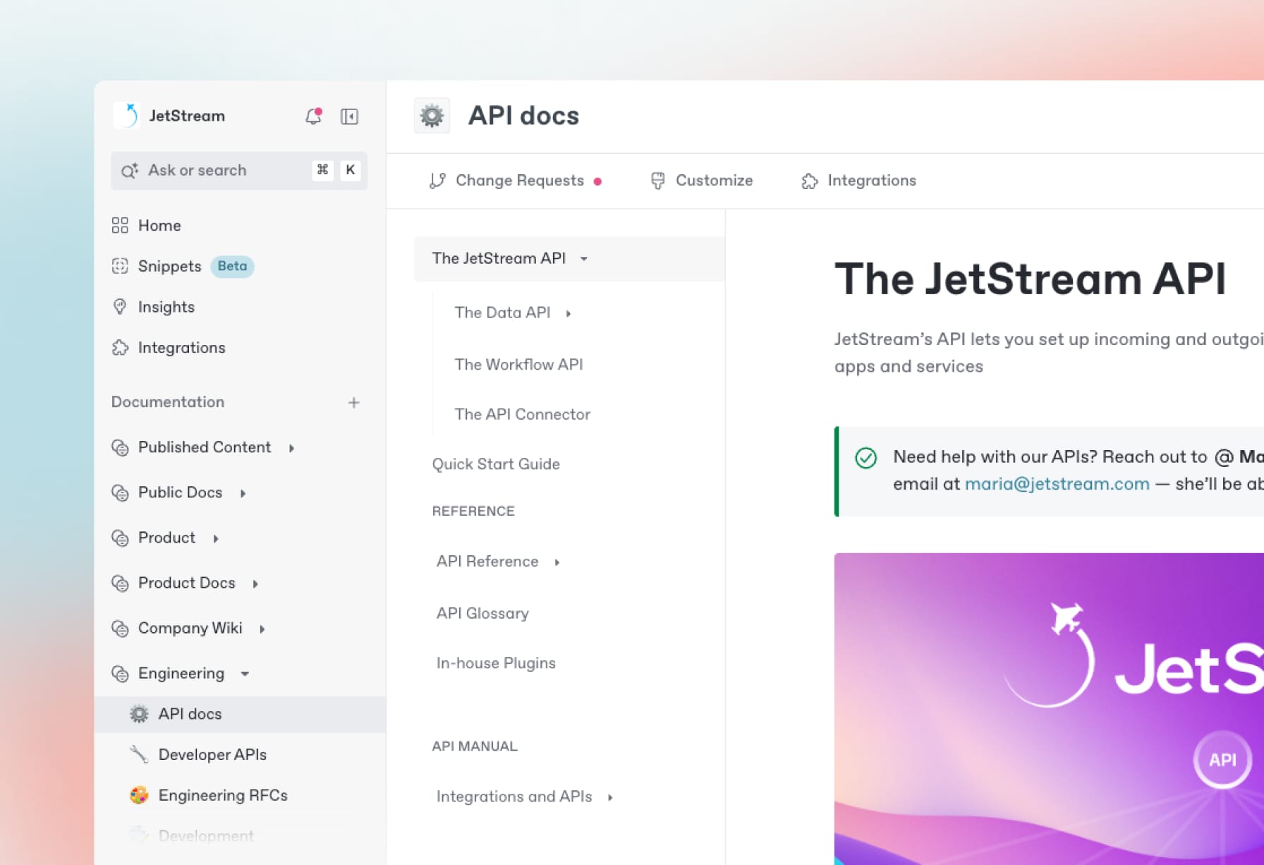
“Next, we looked at removing as much visual weight as we could,” Emily explains. The team stripped back a lot of the outlines in the UI, using soft shadows and lighter colors to simplify things. They changed the sidebar from its old dark blue to a lighter style, and improved the UX and layout. “That was the moment we felt the rebrand come together,” Emily says. “It’s such a key component in the app, it really set the premise for everything else after that.”
Next, the team turned their attention to smaller details — like hover styles and iconography — and started refining Spine, our design system.
“Our biggest UX improvement was adjusting our side-sheets,” says Emily. Before, we used sheets that would slide in from the right edge of the screen to show things like change request details or page history. But they acted like a modal, covering the content of a page so you couldn’t interact with it.

The new side panels don’t block out your content, so you can keep them open while you work if you want.
“Our aim with the redesign was really to ship an improved and more delightful user experience, and sidesheets were on the hit list,” says Viktor Renkema, one of our product engineers. “We replaced them all with side panels, which can stay open while the rest of the UI remains active — just like the sidebar and table of contents to the left.”
Emily chimes in: “We wanted them to sit next to people’s content — to improve readability, and to keep content at the heart of the experience.”
Giving the book a new look
While Emily, Viktor and the rest of the team were quietly revolutionizing the GitBook UI, David was hard at work alongside designer Sebastian Graz, evolving the brand using the new colors and font. But they had another, huge task to work on as well — a new GitBook logo.
“The process was fast-paced, roughly three-to-four months from start to finish,” he tells us. It started with discovery workshops with a few key people on our team, along with a ton of research. “We used FigJams and Miro mood boards to collect inspirational examples from a broad range of industries — not just tech!” he says. These acted as conversation-starters as they moved into the concept stage.

The initial concepts were quite varied — and some of these made it through several iterations before the team found a winner.

David mocked up all kinds of logo, font, and color combinations to see which could work well together.

Part of the development process involved mocking up the logo in different contexts. Alas, none of this swag will ever exist in the real world.
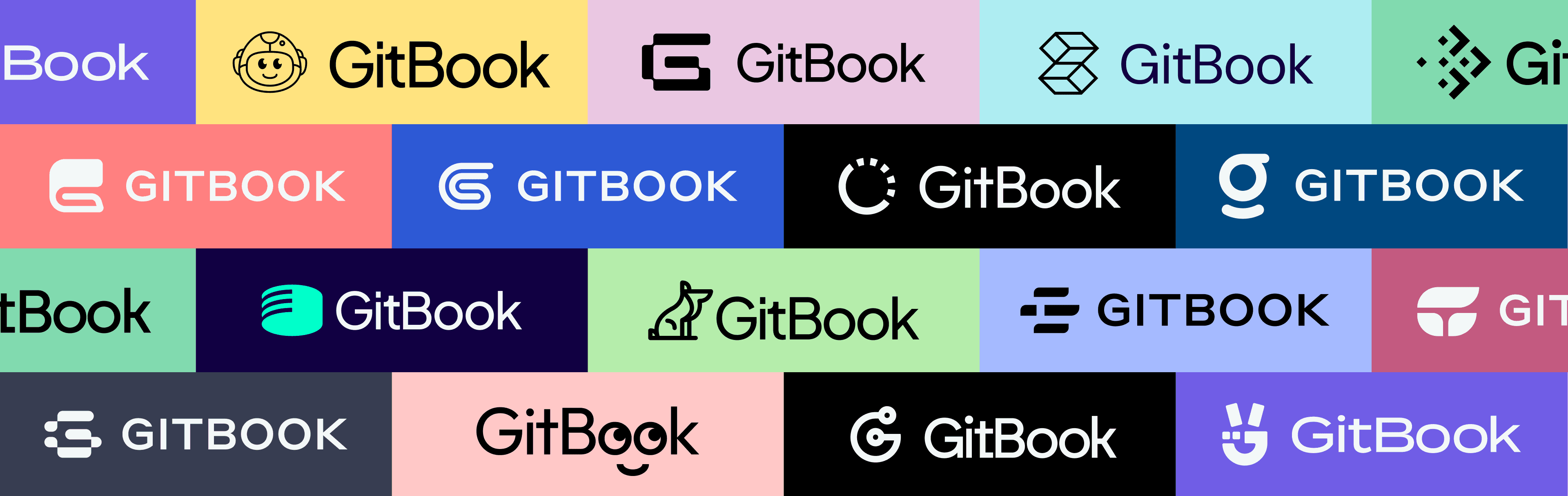
In total, David and Sebastian created more than 60 ideas for new logos — from cute dogs and robots to abstract shapes and evolutions of the book we had before. Together, the team narrowed down a shortlist, then chose a single route that everyone liked. It had nine variants of the same idea — a book forming a G shape — and from there David refined just one concept into the final logo.

Once we settled on a logo we all loved, David tweaked and refined it into the finished article you see today.
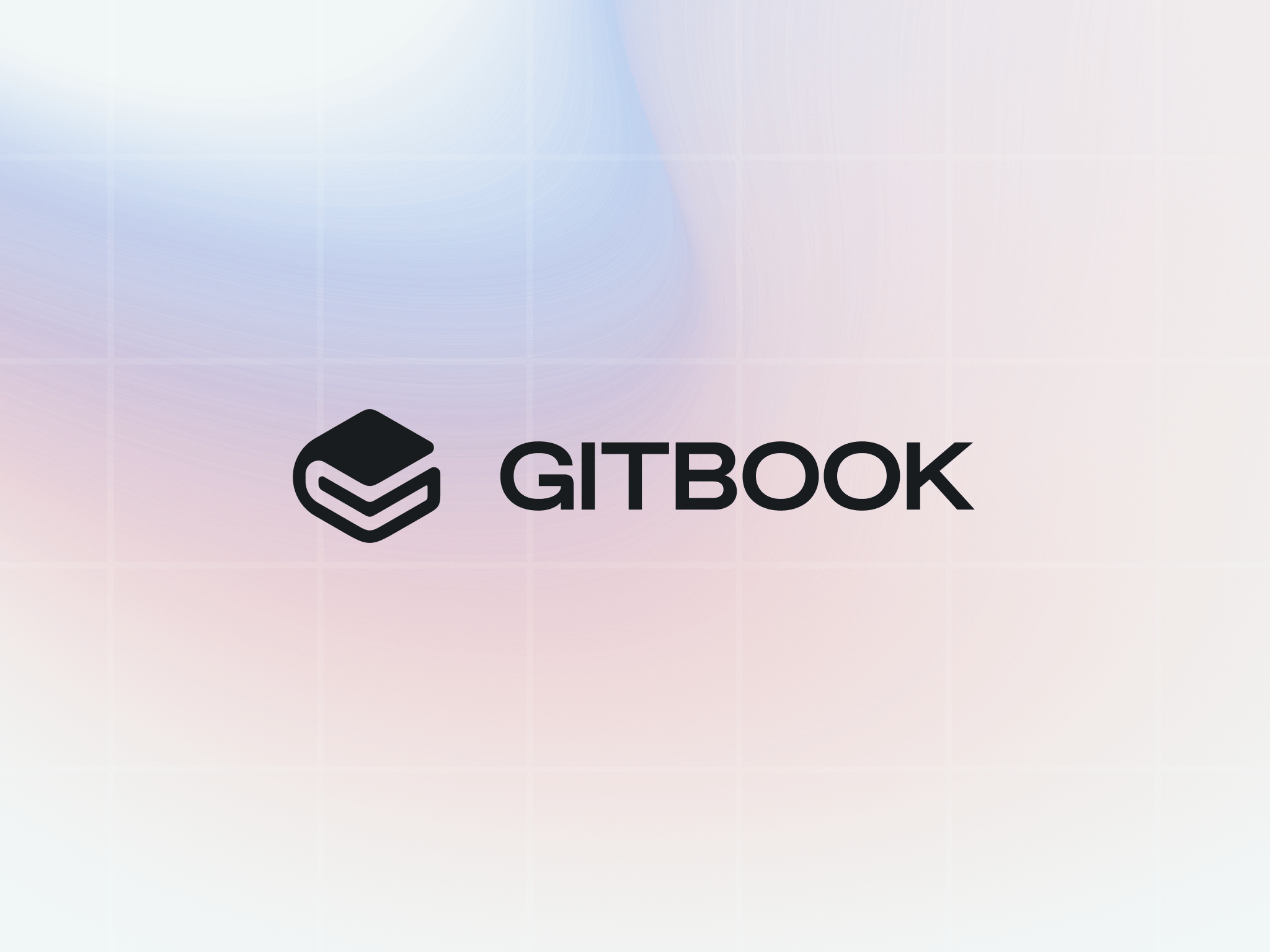
“It’s a huge improvement,” smiles David. “Our previous icon was wide and short which could sometimes make it appear quite small. The new one is much easier to work with. And it works well on its own in apps, favicons, profile images, etc.”

The new GitBook logo and wordmark on a gradient background, using two of our new brand colors.
Adding a little joy
Back with the product design and engineering teams, things were progressing fast. With a laser focus on putting users’ content front and center, the new UI was coming together well. But the teams knew that software development has to be about more than simply function.
“We realized that the beautiful new logo lends itself well to be animated — it can be ‘drawn’ with a single line,” says Viktor. So now, when you open GitBook, you’ll see the logo slowly appear in front of you to show the app is loading. “Although, seeing as we’ve also improved the app’s performance, ideally you won’t see it much!” he says with a grin.
This is the full animation — although you hopefully won’t see it all in the app itself, thanks to our improved performance.
Viktor also decided to experiment a little more with animation and interactivity. Firstly, he explored adding more screen real estate by giving you the option to collapse the table of contents. “We always want to make GitBook more fun to use, so I decided to animate that new interaction,” he explains. “It’s fast enough not to delay your workflow, but smooth enough to give a polished experience.”
It’s subtle, but this neat animation was a labor of love for Viktor. And the option to hide your table of contents means you can focus on your content.
These are just two of the nice touches our team added in this redesign, but there are more — keep an eye out for them!
There’s still work to do
This huge effort from our design and product teams helped GitBook end 2023 on a high. We loved seeing your reactions to it, and the teams have a lot to be proud of.
“The decision to not just settle for the minimum and really go all in is what I’m the happiest about for sure,” smiles Emily. “Luckily we have an amazingly dedicated team and it’s a joy to work alongside them!”
But what’s next for the product? Aside from our recent launch and some other exciting plans we’re working on right now, the design team is working on refining Spine, our design system — and getting as much user feedback as possible to help guide those improvements.

The team was thrilled to receive some new swag to celebrate the launch. That sweater really is cozy.
As for the brand? Well, David also designed some awesome swag for the team and our partners using the new branding. And he’ll be making even more this year — maybe there’ll even be an opportunity to get your hands on it too?
We’re also sponsoring some big events this year — so look out for the new GitBook branding, and come say hi if you see us!
→ New in GitBook: Write with AI, turn snippets into docs, and more
Towards the end of last year, you might’ve noticed some pretty big changes with GitBook. Sure, we released some epic new features — but we also gave our entire UI and brand a new look.
It was a pretty huge undertaking. Reworking the brand is always a big task, but implementing the same branding into the product and launching everything at the same time? It was a tough ask, and took weeks of work from everyone on the design, engineering and marketing teams.
So after all that hard work, we thought it would be interesting to sit down with some of the people behind the new look and find out more. Read on to discover subtle animations, big font decisions, and why we didn’t go with the ‘cute robot’ GitBook logo.
Goodbye 2010s
Before we get into the juicy stuff, let’s take a look back at how GitBook looked before.
Our previous design used darker UI elements. As you’ll see, the new UI is far more modern and reflects how far GitBook has come!
While our old design was beautiful in its own way, it was certainly showing its age, and it didn't reflect our growth over the last few years. GitBook has evolved in so many ways since its launch, most recently with some incredible AI features that make documentation effortless. Today, it’s a streamlined, modern knowledge-sharing platform — and we wanted the brand and the product to reflect that.
“One of our main goals modernizing the UI and making the app visually lighter and fresher overall,” says Emily Cressey, one of our product designers. “We’ve been wanting to tackle this for a long time.”
In short, we needed a glow-up.
Choosing a font
The team started diving into several different areas at the same time. Marketing started looking at how to make the brand feel fresh, while the product team focused on general improvements they could make to the app while we were doing some sprucing up. “We really wanted to make the product more visually cohesive, with a shared visual language,” explains Emily. “We also had some UX and UI ‘debt’ that we needed to address.”
One of the big questions was about our font. Before, we used Inter — a robust open-source typeface with impressive language support and legibility. But it was time to look at some other options.
“It was the biggest challenge,” explains Emily. “Choosing a typeface that represents the brand but also works within the app? We’re a text-based product, so we had to think about accessibility, while also making sure we had enough versatility where weights were concerned.”
The team tried dozens of typefaces, mocking up marketing visuals and in-app UIs to find something that ticked all the boxes. After days of searching, they settled on ABC Favorit.
We loved Favorit’s personality, accessibility and extended family. Just look at the descender on that y!
“It’s a practical typeface with some quirky features that also has an extended family,” says David Hughes, our marketing design lead. “Perfect for marketing visuals!”
Don’t worry though — Inter wasn’t left out in the cold. We maintained it as our fallback font, for when the primary typeface isn’t available. We still love you Inter!
Time for an upgrade
With the font locked in, the product team could get down to business. “We started by implementing the new typeface and looked at how much impact that had on the overall UI and visual style of the app,” explains Emily. “Then we delved into experiments with our new brand palette to find a primary color.”
The new palette offered a lot more variety — including pinks and yellows. And with the marketing design team adding gradients to their toolbox, the product team had to strike a careful balance. After all, the app still needed to feel like GitBook.
In the end, the team settled on teal. “It felt fresh, but didn’t stray too far from the ‘GitBook Blue’ we had before,” says Emily. Importantly, it didn’t compromise on contrast either.
Just these two changes made a huge difference to the look and feel of the app. But the team was only getting started.
Simplifying the GitBook UI
“Next, we looked at removing as much visual weight as we could,” Emily explains. The team stripped back a lot of the outlines in the UI, using soft shadows and lighter colors to simplify things. They changed the sidebar from its old dark blue to a lighter style, and improved the UX and layout. “That was the moment we felt the rebrand come together,” Emily says. “It’s such a key component in the app, it really set the premise for everything else after that.”
Next, the team turned their attention to smaller details — like hover styles and iconography — and started refining Spine, our design system.
“Our biggest UX improvement was adjusting our side-sheets,” says Emily. Before, we used sheets that would slide in from the right edge of the screen to show things like change request details or page history. But they acted like a modal, covering the content of a page so you couldn’t interact with it.
The new side panels don’t block out your content, so you can keep them open while you work if you want.
“Our aim with the redesign was really to ship an improved and more delightful user experience, and sidesheets were on the hit list,” says Viktor Renkema, one of our product engineers. “We replaced them all with side panels, which can stay open while the rest of the UI remains active — just like the sidebar and table of contents to the left.”
Emily chimes in: “We wanted them to sit next to people’s content — to improve readability, and to keep content at the heart of the experience.”
Giving the book a new look
While Emily, Viktor and the rest of the team were quietly revolutionizing the GitBook UI, David was hard at work alongside designer Sebastian Graz, evolving the brand using the new colors and font. But they had another, huge task to work on as well — a new GitBook logo.
“The process was fast-paced, roughly three-to-four months from start to finish,” he tells us. It started with discovery workshops with a few key people on our team, along with a ton of research. “We used FigJams and Miro mood boards to collect inspirational examples from a broad range of industries — not just tech!” he says. These acted as conversation-starters as they moved into the concept stage.
The initial concepts were quite varied — and some of these made it through several iterations before the team found a winner.
David mocked up all kinds of logo, font, and color combinations to see which could work well together.
Part of the development process involved mocking up the logo in different contexts. Alas, none of this swag will ever exist in the real world.
In total, David and Sebastian created more than 60 ideas for new logos — from cute dogs and robots to abstract shapes and evolutions of the book we had before. Together, the team narrowed down a shortlist, then chose a single route that everyone liked. It had nine variants of the same idea — a book forming a G shape — and from there David refined just one concept into the final logo.
Once we settled on a logo we all loved, David tweaked and refined it into the finished article you see today.
“It’s a huge improvement,” smiles David. “Our previous icon was wide and short which could sometimes make it appear quite small. The new one is much easier to work with. And it works well on its own in apps, favicons, profile images, etc.”
The new GitBook logo and wordmark on a gradient background, using two of our new brand colors.
Adding a little joy
Back with the product design and engineering teams, things were progressing fast. With a laser focus on putting users’ content front and center, the new UI was coming together well. But the teams knew that software development has to be about more than simply function.
“We realized that the beautiful new logo lends itself well to be animated — it can be ‘drawn’ with a single line,” says Viktor. So now, when you open GitBook, you’ll see the logo slowly appear in front of you to show the app is loading. “Although, seeing as we’ve also improved the app’s performance, ideally you won’t see it much!” he says with a grin.
This is the full animation — although you hopefully won’t see it all in the app itself, thanks to our improved performance.
Viktor also decided to experiment a little more with animation and interactivity. Firstly, he explored adding more screen real estate by giving you the option to collapse the table of contents. “We always want to make GitBook more fun to use, so I decided to animate that new interaction,” he explains. “It’s fast enough not to delay your workflow, but smooth enough to give a polished experience.”
It’s subtle, but this neat animation was a labor of love for Viktor. And the option to hide your table of contents means you can focus on your content.
These are just two of the nice touches our team added in this redesign, but there are more — keep an eye out for them!
There’s still work to do
This huge effort from our design and product teams helped GitBook end 2023 on a high. We loved seeing your reactions to it, and the teams have a lot to be proud of.
“The decision to not just settle for the minimum and really go all in is what I’m the happiest about for sure,” smiles Emily. “Luckily we have an amazingly dedicated team and it’s a joy to work alongside them!”
But what’s next for the product? Aside from our recent launch and some other exciting plans we’re working on right now, the design team is working on refining Spine, our design system — and getting as much user feedback as possible to help guide those improvements.
The team was thrilled to receive some new swag to celebrate the launch. That sweater really is cozy.
As for the brand? Well, David also designed some awesome swag for the team and our partners using the new branding. And he’ll be making even more this year — maybe there’ll even be an opportunity to get your hands on it too?
We’re also sponsoring some big events this year — so look out for the new GitBook branding, and come say hi if you see us!
→ New in GitBook: Write with AI, turn snippets into docs, and more

Get the GitBook newsletter
Get the latest product news, useful resources and more in your inbox. 130k+ people read it every month.
Similar posts

Create, search and manage your knowledge at scale. Effortlessly.
Create, search and manage your knowledge at scale. Effortlessly.
Create, search and manage your knowledge at scale. Effortlessly.
Create, search and manage your knowledge at scale. Effortlessly.